I opened Canva Magic Studio 2025 after a client DM’d me at 10:42 p.m.: “Can we make the launch assets trendier… by tomorrow?” Classic. I’ve used Canva forever, but the “Magic Studio” badge had been sitting there like a shiny button I kept ignoring. So I made coffee, clicked in, and promised myself I’d bail if it felt like fluff. Here’s what actually helped, what was meh, and how I’d use it if you’re building social posts, ads, or multilingual campaigns. If you’re searching for Canva Magic Studio 2025 because you need faster content without robo-vibes, this is for you.
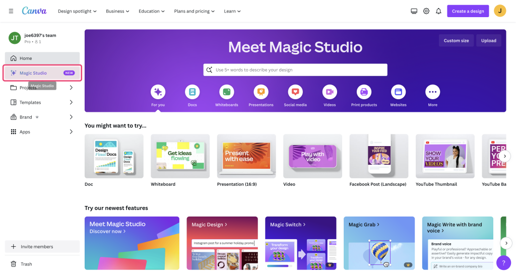
Canva Magic Studio 2025 Overview
I’ll keep it simple: Canva Magic Studio 2025 tries to glue AI drafting, layout, and resizing into one flow, so you stop hopping tabs. It’s not a brand-new app: it’s a beefed-up layer inside Canva that feels more opinionated about your workflow.
AI Template Features
I tested the “Magic Start” prompt with a real brief: “3 Instagram carousels for a product launch, bold, friendly, Gen Z color, include CTA.” It spit out three layout options with editable text and suggested color palettes. I expected generic stock vibes, but two concepts were genuinely usable. The third looked like a corporate slideshow in disguise, so I archived it, no hard feelings.
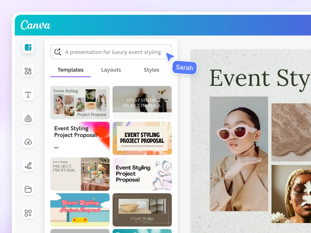
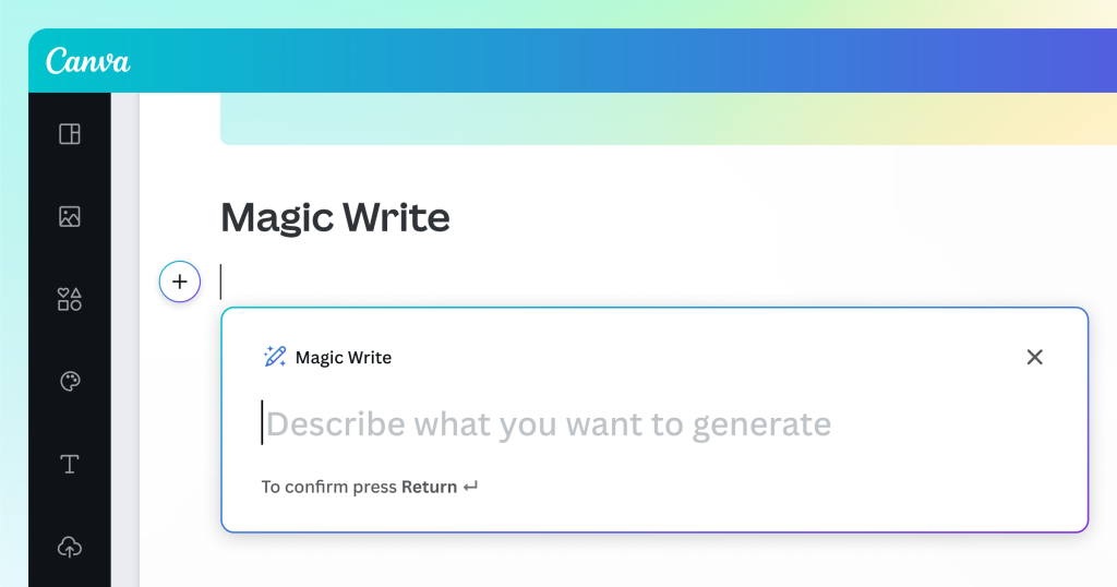
The standout: AI Template Variants. You pick a base style and it offers quick alternates, same vibe, different composition. It’s like asking a designer for three comps without the awkward Slack messages. Also helpful: Magic Write for captions and microcopies. I wouldn’t paste it raw (still a bit crisp), but it’s a strong first draft for hooks and CTAs. I edited tone and localized slang, and it held up.
User-Friendly Updates
Small things that matter: the new side panel shows brand kits, recent assets, and AI actions without hiding your canvas. The alignment nudges feel smarter, elements snap cleanly even when you’re speed-dragging. Background removal is faster and less “halo-y” around hair, which saved me on a last-minute portrait cutout. Not gonna lie, the search for templates is still noisy: I had to use very specific keywords to dodge the Pinterest-y templates. But once I got into Magic Studio’s suggestions, the quality tightened up.

Design Workflow
Here’s the exact flow I used to get from brief to export without spiraling.
Template Selection
I opened Magic Start, pasted the brief, and toggled “Carousel” + “Instagram.” I asked for “bold sans, high contrast, energetic.” It returned templates with big headlines, 2–3 image slots per slide, and consistent icon sets. Pro tip: click “See more like this” on the one that’s 70% right instead of over-editing the wrong layout. The system learns your taste inside the session, felt subtle but real.
I also tested a Reels cover + square post bundle. The bundling is underrated: your cover, square, and story layouts inherit the same hierarchy, so you don’t spend time re-deciding sizes or type scales. For a campaign day, that’s sanity-saving.
Customization Steps
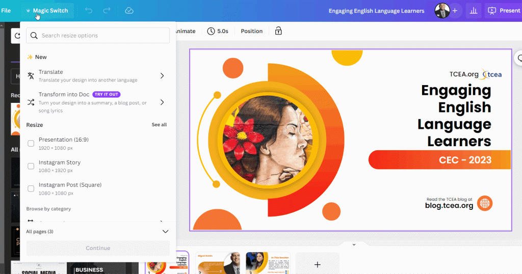
- Colors: I snapped in the brand kit, then used Magic Switch to apply colors intelligently. It handled contrast decently, still double-check the small body text on dark backgrounds.
- Typography: I bumped headline tracking down a hair (AI loves roomy tracking), and swapped one subhead to a friendlier weight. Two clicks, instant lift.
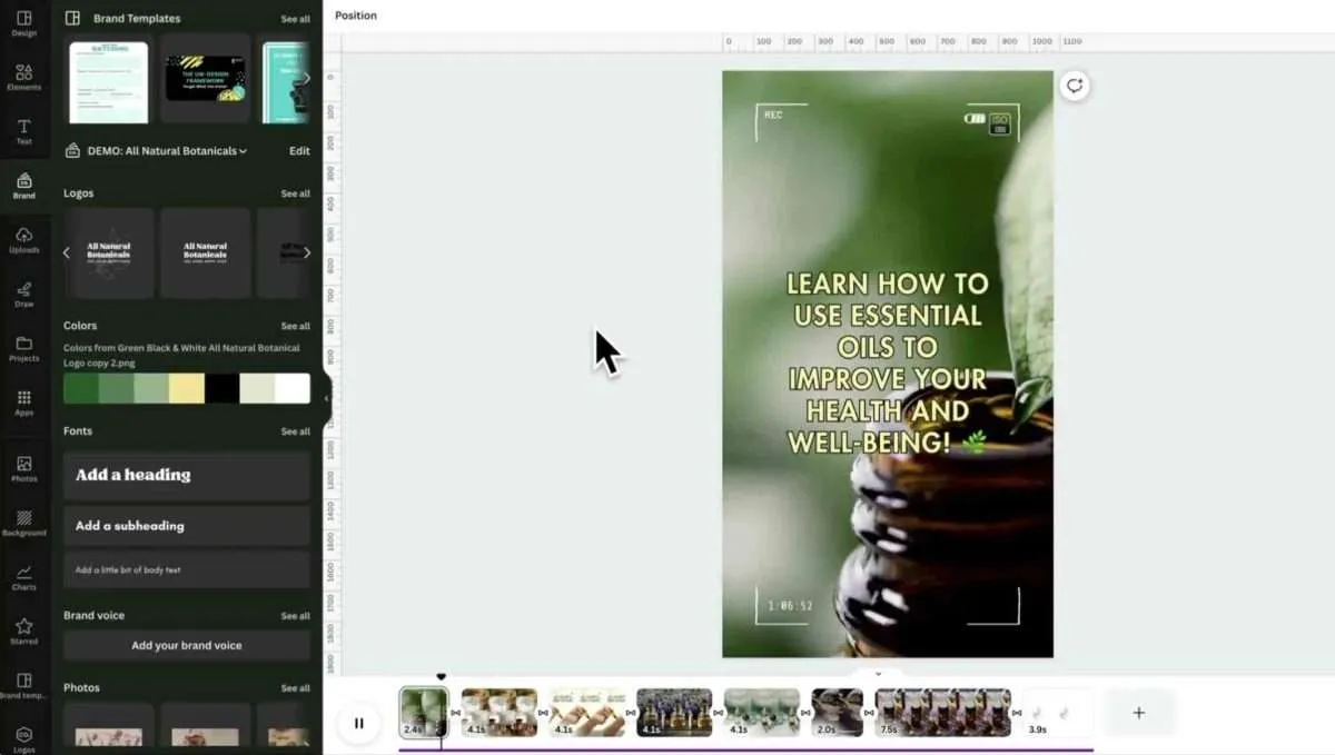
- Imagery: The image suggestions were fine, but I uploaded client shots and used Background Remover 2.0 (way cleaner on wispy hair). I added a tiny grain overlay to unify the set, still looks like me, not a template.
- Copy: Magic Write gave me 5 hook options. I combined two, added a playful verb, and localized one line for our CN audience. If you write SEO blogs or ad copy, this is where Magic Write cuts draft time by half, as long as you keep your branded voice on top.
- Resizing: Magic Resize → TikTok, LinkedIn, Stories. It didn’t nail every crop, but the Auto Layout fixes got me 80% there. I manually nudged icons and re-centered headlines on tall formats.
Global Use Cases
I work across markets, so “looks good” isn’t enough. It has to read well in multiple languages and format families.
Multilingual Designs
Magic Translate handled English to Simplified Chinese and Spanish without mangling brand terms (after I pinned a glossary, do this). Line breaks stayed neat, which is usually the nightmare part. I still tweaked idioms: the AI goes literal in slang. The nice bit: font fallbacks automatically switched to compatible families for Chinese without wrecking the layout. I did a quick kerning pass and it was launch-ready.
Field note: auto-generated alt text is available, and while it’s not poetry, it’s acceptable for accessibility at scale. Edit the first one, then duplicate across the set.
Social Media Ads
I ran a quick test with Meta and TikTok specs. The ad variants generator is actually helpful for A/B tests: it offered three headline angles (benefit, urgency, curiosity) and matched visuals. I removed the hypey one, kept the benefit + curiosity pair, and shipped it. CTRs? Too early to brag, but the previews were faithful to platform norms, no weird cropping or cut-off CTAs.
If you’re managing influencer packs: the talent release slides and UGC-style frames felt fresh, not stocky. I replaced the default stickers with our own pack to avoid that “I’ve seen this template” vibe.
Tips for Speed
Automation Hacks
- Start with prompts that include vibe, platform, and outcome: “Gen Z, playful, Instagram carousel, announce waitlist, 6 slides.” You’ll get better templates and fewer rewrites.
- Use branded kits aggressively. Colors, logos, and tone presets shorten every decision. If you manage multiple clients, make separate kits and lock them.
- Build a “snippet shelf” in Magic Write: approved hooks, CTAs, and disclaimers. Paste, tweak, done.
- Batch resize after finalizing your master design. Fix crops in one pass, not per-export.
- Save a personal overlay pack (grain, borders, texture). It’s the quickest way to make AI templates look like your style.
- For multilingual, add a glossary and do one manual pass on idioms. You’ll avoid awkward literal translations.
- When AI stalls, duplicate the page and try a new micro-prompt: “swap hero photo to lifestyle,” or “shift palette to cooler blues.” Small prompts > big rewrites.
If you’re wondering whether canva magic studio 2025 genuinely speeds up social content: yes, if you lean into its templates and keep your brand guardrails tight. It won’t replace your eye, but it will clear the grunt work. If you want pixel-perfect art direction from scratch, you’ll still be happier in Figma or Photoshop. But for creators and marketers who ship daily across platforms, this is the rare button worth clicking.
Frequently Asked Questions
What is Canva Magic Studio 2025 and how does it streamline your design workflow?
Canva Magic Studio 2025 layers AI drafting, layout, and resizing into one flow so you stop switching tabs. It suggests templates, auto-generates copy, and adapts layouts across formats while keeping your brand kit front and center. It’s built for faster social, ad, and campaign production without losing creative control.
How do I use Magic Start to create Instagram carousels quickly?
Open Magic Start, paste a brief with vibe, platform, and outcome (e.g., “Gen Z, playful, Instagram carousel, 6 slides”). Review the AI’s layout options, click “See more like this” on the closest match, then refine colors via your brand kit, tweak typography, replace imagery, and polish hooks with Magic Write.
Can Canva Magic Studio 2025 handle resizing for TikTok, LinkedIn, and Stories?
Yes. Use Magic Resize to generate platform variants, then apply Auto Layout to fix most crops and alignment. Expect about 80% accuracy out of the box—manually nudge icons, headlines, and focal points on tall formats. Bundling related assets (covers, squares, stories) keeps hierarchy consistent across placements.
Is Magic Translate good for multilingual campaigns, and how should I use glossaries?
Magic Translate performs well for English, Simplified Chinese, and Spanish when you pin a glossary to protect brand terms. Line breaks and font fallbacks typically hold layout integrity. Always fine-tune idioms and do a quick kerning pass, then reuse edited alt text across the set for consistency and accessibility.