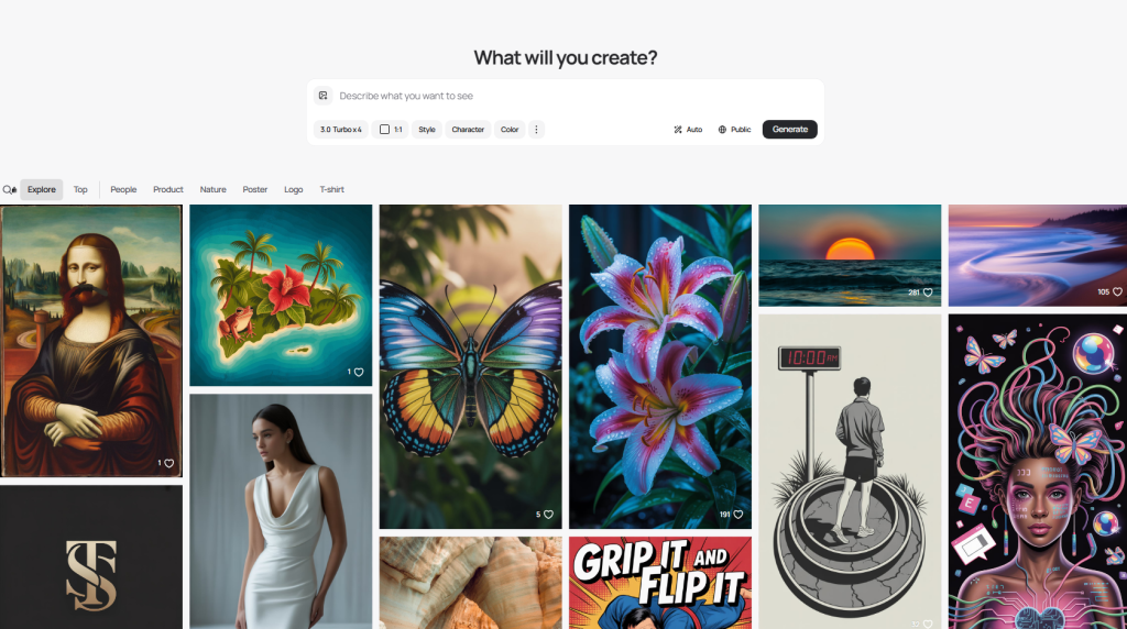
On November 10, 2025, I sat down with a mug of coffee and a petty goal: make Ideogram write clean, centered text on a t‑shirt design in under 10 minutes. I’ve had mixed luck with text-in-image tools, so I wanted to see if Ideogram could be the one I’d actually keep open. Spoiler: it surprised me in a good way, especially when I stopped treating prompts like poetry and started treating them like instructions.
Not sponsored, just honest results from my own tests in the Ideogram web app (v3 label in the UI). I generated 26 images across 7 prompts. About 65% hit my “usable without edits” bar. Here’s what worked, what flopped, and the Ideogram prompt tips I wish I had on day one.
Ideogram Prompt Basics
Structuring Prompts for Ideogram AI
I get better results when I write prompts like a short creative brief. One line for subject, one line for style, one line for text/layout constraints. Simple beats clever.
My go-to structure:
- Subject: what’s in the image
- Style: the visual vibe (photographic, vector, retro print, etc.)
- Text: exact wording + casing + placement
- Composition: camera or layout notes (centered, negative space, symmetrical)
- Constraints: aspect ratio, background, color limits
Example (tested 2025-11-10):
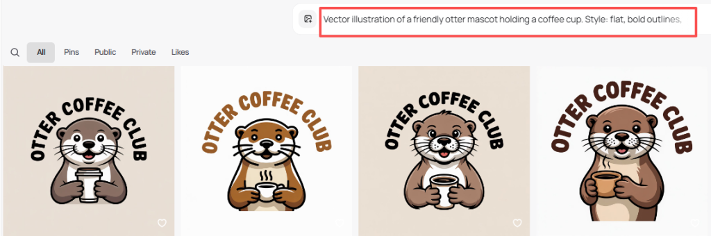
“Vector illustration of a friendly otter mascot holding a coffee cup. Style: flat, bold outlines, limited palette (3 colors). Text: ‘OTTER COFFEE CLUB’ all caps, centered, curved above the mascot. Composition: balanced, lots of negative space. Constraint: transparent background, 1:1.”
Result: Clean curves, correct casing, good spacing. I only had to nudge color in a quick edit.
Key Elements for Accurate Results
A few levers mattered more than I expected:
- Exact text with casing: Put the text in quotes, and say “all caps” or “title case.” This reduced typos in my tests.
- Layout verbs: “Centered,” “stacked,” “curved above,” “small footer line.” Layout words changed outcomes more than style words.
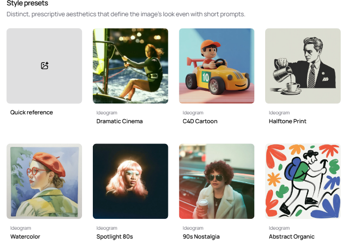
- Style anchor: One strong style phrase beats a list of ten. “Retro screen print” or “editorial product photo” keeps Ideogram focused.
- Negative prompts (light touch): If you need clean typography, try: “no gradients, no bevels, no drop shadows.” Overdoing negatives backfired for me.
- Aspect ratio early: Include 1:1, 3:4, 16:9 at the end of your main prompt so the model frames the shot right from the start.
If you’re new to Ideogram, peek at their official site to see current features and style examples.
Common Ideogram Prompt Mistakes
Overly Vague or Confusing Prompts
My worst outputs came from prompts like: “make a cool poster with vibes.” The model fills in the blanks, and it won’t be your taste. Vague style and no constraints equals chaos.
Also, mixing metaphors, “cinematic watercolor blueprint neon film still”, made it hedge. The image looked like four styles fighting for custody.
Fix: Cut to essentials. One subject, one primary style, clear text line, simple composition.
Ignoring Style and Output Constraints
I lost time when I forgot constraints:
- No aspect ratio → weird cropping.
- No background note → busy textures behind text.
- No color limit → muddy palettes.
Quick save: add “transparent background” for logos, “white background” for product mockups, or “solid pastel background” for social graphics. And always pin text placement with “centered,” “top arc,” or “bottom footer.”
Good vs Bad Ideogram Prompt Examples
High-Quality Prompts That Work
All tested on 2025-11-11: each produced at least one image I’d use as-is.
- Poster with readable text
“Bold concert poster for an indie band. Style: risograph print, high contrast, grain. Text: ‘NIGHT SWIM’ all caps, centered headline: small subline ‘Live at The Tide, Dec 12′. Composition: large headline, generous margins. Colors: black, teal, cream. Aspect: 4:5.”
Why it works: Clear hierarchy and limited palette. The model respected margins.
- Brand mark with curved text
“Minimal logo: smiling croissant icon. Style: clean vector, no gradients. Text: ‘BUTTER JOY’ all caps, curved above the icon. Constraint: transparent background, 1:1, 2 colors only.”
Why it works: Tight constraints: typography stayed clean.
- Product mockup photo
“Studio photo of matte black wireless earbuds on a soft gray background. Style: editorial product photography, soft diffused lighting, subtle reflection. Text: none. Composition: centered object with negative space. Aspect: 16:9.”
Why it works: Removing text let the model focus on lighting and shape.
Prompts That Often Fail
- “Make it cool, modern, and vintage at the same time.” Conflicting cues cause mush.
- “Logo for cafe. Cool.” Too short, no text, no style, no constraints.
- “Add text somewhere.” Somewhere equals nowhere. Be specific.
If you’re stuck, try this quick fix: rewrite your prompt to include one subject, one style anchor, exact text in quotes, one placement instruction, and one constraint. It’s boring. It works.
Ideogram Prompt Templates
How to Customize Templates for Your Needs
Steal these and tweak. I’ve marked variables in CAPS. These are the Ideogram prompt tips I reach for first.
- Logo with curved headline
“Minimal logo for BRAND NAME. Icon: SIMPLE ICON (e.g., sprout, bolt). Style: clean vector, no gradients, thick lines. Text: ‘HEADLINE TEXT’ all caps, curved above the icon: small footer ‘TAGLINE’ below. Colors: TWO COLORS ONLY. Background: transparent. Aspect: 1:1.”
- T‑shirt graphic with centered type
“Graphic for T‑shirt: SUBJECT. Style: retro screen print, halftone texture, limited to 2 inks. Text: ‘PHRASE’ all caps, stacked lines, centered. Composition: big type, small illustration accent. Background: solid. Aspect: 1:1.”
- Social promo image
“Promo graphic for PRODUCT/EVENT. Style: bold editorial, high-contrast shapes. Text: headline ‘TITLE’ in title case: subline ‘DETAILS’ smaller. Composition: clear margins, rule-of-thirds alignment. Colors: BRAND PALETTE (3 colors). Aspect: 1080×1350 (4:5).”
- Photo-real mockup
“Photo of SUBJECT on BACKGROUND. Style: studio lighting, soft shadows, realistic texture. Text: none. Composition: centered with negative space. Aspect: 16:9.”
- Typography-first poster
“Poster design. Style: Swiss/International typographic style. Text: ‘MAIN TITLE’ all caps: ‘DATE • VENUE’ small footer. Composition: grid layout, generous whitespace, left alignment. Colors: black, white, ONE ACCENT. Aspect: 3:4.”
How I customize fast:
- Swap style anchors: “retro screen print” → “flat vector” → “risograph” and keep everything else.
- Lock text early with quotes and casing. If Ideogram misspells, regenerate before changing the layout.
- If spacing is tight, add: “generous margins,” “wide tracking,” or “loose kerning.” Yes, the model understands those enough to help.
- When it gets too artsy, add: “no grunge, no glow, no bevels.”
My quick workflow from 2025-11-11 (5 prompts, ~12 minutes):
- Draft prompt with structure above.
- Generate 4 images.
- Keep best 1–2: if text off, I tweak only the text/placement line.
- Export PNG: minor color tweaks in Figma.
If you want more depth, Ideogram’s releases and examples on their official site are a good pulse check: ideogram.ai. Also, if you like this format, I’m putting together a living prompt sheet, ping me and I’ll share the link when it’s ready.
Last note: Ideogram won’t replace a designer’s eye, but it’s a solid partner when you give it a tight brief. Think of it like a junior designer who thrives on clarity. Feed it clarity, and it feeds you decent art.
Alright, I’m off to test a weird idea: curved neon type on a waffle. Don’t ask.
Previous posts: