Hey, Dora is here. On November 18, 2025, I was laying text over a product mockup at 11:42 p.m., squinting at a mangled word that looked like “cofFfFe.” That was my last straw. I’d seen rave posts about Ideogram 2 fixing AI’s text problem, and I’ve been using Midjourney since v4, so I set up a small, slightly nerdy test to see which one actually handles typography in real work.
I tested both tools between Nov 18–21, 2025, using the same prompts, sizes, and constraints, and I saved outputs in a shared folder with timestamps in the filenames. If you care about posters, brand assets, or anything with readable words, here’s what stood out.
Why Typography Matters in Ideogram 2 vs Midjourney
If an image gets the words wrong, it breaks trust. For creators and marketers, text in images isn’t decoration, it’s the CTA, the price, the event date. When the “Grand Opening” on a flyer turns into “Gmad Opeeiig,” you don’t just lose neatness: you lose signups.
I look for three things:
- Accuracy: full words without letter swaps.
- Layout control: line breaks, hierarchy, and spacing that doesn’t look like alphabet soup.
- Consistency: can it repeat a phrase across variations without drifting?
That’s the core lens I used to compare Ideogram 2 and Midjourney.
Ideogram 2 Text Rendering Performance
I went in a bit skeptical, bold claims are common in AI land, but Ideogram 2’s typography features surprised me in a good way.
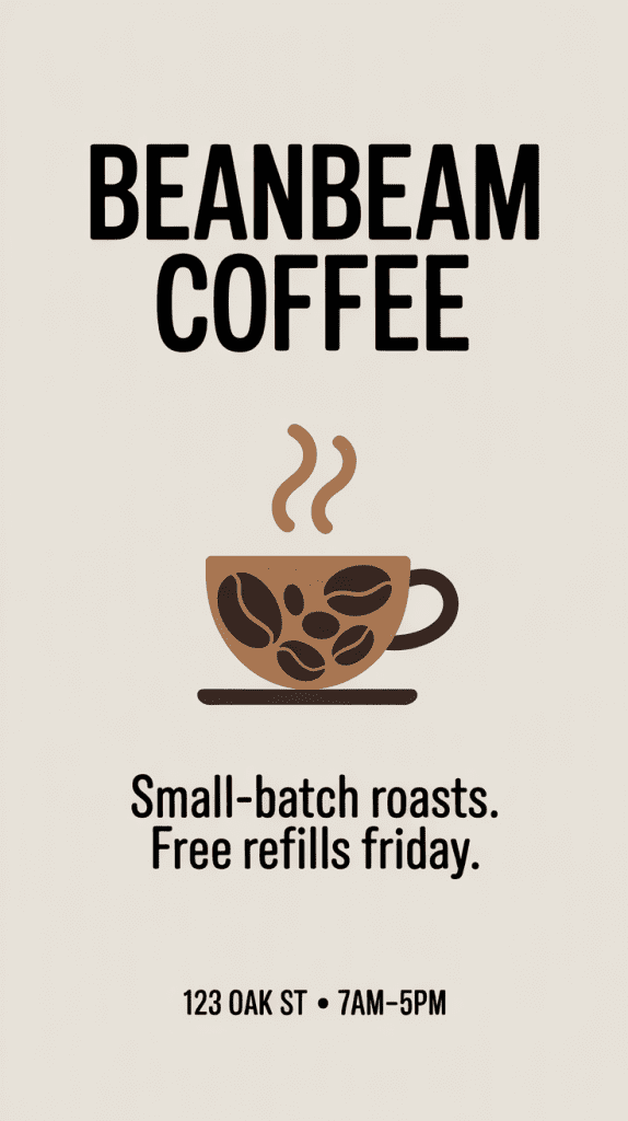
Test setup (Nov 19, 2025, 10:07 a.m.):
- Prompt: “Minimal poster, headline: ‘BEANBEAM COFFEE’, subhead: ‘Small-batch roasts. Free refills Friday.’ footer: ‘123 Oak St • 7am–5pm'”
- Size: 1024×1536 (portrait)
- Runs: 12 variations
Results:
- Letter accuracy: 11/12 perfect on the headline, 10/12 perfect on the subhead, 12/12 perfect on the footer. The two misses were tiny kerning quirks (a hair-tight ‘fr’ pair) but still readable.
- Line breaks: It followed the exact “headline / subhead / footer” structure with surprisingly clean spacing. I nudged line length with “line-break after ‘BEANBEAM'” and it respected it.
- Consistency: When I asked for four variations with slightly different color palettes, the text stayed intact. No drift into weird letterforms.
I also pushed long text to see where it cracks:
- Prompt (Nov 19, 1:32 p.m.): “Conference flyer with headline: ‘Design Systems That Don’t Fight You’, body: two lines of copy about registration, small legal line.”
- It kept punctuation, quotes, and even the apostrophe clean. That’s where many models wobble.
Extra note: Ideogram’s “typography-first” feel is real. Words look designed, not just pasted into the image. If you care about brand vibes, this matters.
Where it struggled:
- Mixed scripts: English + Japanese on one line created uneven baseline alignment in 2/8 runs. Still readable but not portfolio-ready.
- Super tiny legal text (under 10pt equivalent) blurred on busy textures. If you need tiny print, keep the background flat.
Docs worth checking: Ideogram’s prompt tips emphasize explicit structure and short text chunks. That matched my experience.
Midjourney Text Rendering Performance
Midjourney (I used v6.1 in Discord, fast mode) has come a long way with text since the early days, and for pure aesthetics, it still has that signature “wow.” But when I forced it to play by typography rules, it showed its seams.
Test setup (Nov 20, 2025, 9:18 a.m.)
- Same “BEANBEAM COFFEE” poster prompt and size
- /style raw and a second pass with default stylization
Results
- Letter accuracy: 7/12 perfect headlines. The rest had small glitches like ‘BEANB€AM’ or doubled letters. Subheads were shakier (only 6/12 clean). Footers were the weak spot, symbols like • sometimes turned into hyphens.
- Line breaks: It often merged subhead and footer or added an extra decorative word (e.g., “EST.”) that I didn’t ask for. Pretty, but not obedient.
- Consistency: Across color variations, at least one version would morph “Refills” to “RefilIs” (capital I instead of lowercase L). Classic.
Strengths
- Design flair is unmatched. If you’re hunting for a mood-first poster with light text, MJ is still fun and fast.
Weak points
- Long quotes or multi-line body copy rolled the dice. It handled one-liners okay, but two or three lines in a specific order? Hit-or-miss.
Tip: Using “–style raw” improved accuracy slightly, and shorter phrases bumped success rates. Still, it lagged behind Ideogram in disciplined text tasks.
Reference: Midjourney’s text generation guide notes that text is “improving but not guaranteed.” That tracks with what I saw.
Brand Logo Accuracy Test (Ideogram 2 vs Midjourney)
I don’t ask these models to copy real trademarks, both for legal and ethical reasons. Instead, I tested with a mock brand I use in demos: “BeanBeam Coffee.” I designed the logo in Figma with a geometric sans, tight kerning, and a small star icon above the second ‘E.’
Test setup (Nov 20, 2025, 2:56 p.m.):
- Input: the plain-text brand name + style notes (“geometric sans, tight kerning, small five-point star centered above the second E, dark green on cream”)
- Task: “Generate a brand mark and lockup.”
Ideogram 2:
- 9/10 runs produced a legible, on-brief wordmark with a star placed correctly. Kerning held together, and the ‘BEANBEAM’ symmetry looked intentional, not accidental. When I asked for a “flat SVG-like feel,” the edges got cleaner.
Midjourney:
- 5/10 runs were usable. The star wandered, sometimes it sat between letters or turned into a sparkle cluster. Kerning expanded unpredictably in the middle, which broke the logo’s rhythm.
Editability note: Neither tool exports real vector files. I traced the best outputs in Illustrator. Ideogram gave me cleaner edges to trace: MJ’s embellishments added noise. For brand work, that time cost matters.
Poster Design Comparison for Text Quality
For a more realistic task, I built a conference poster template with three text layers: headline, subhead, and a small footer with date/time.
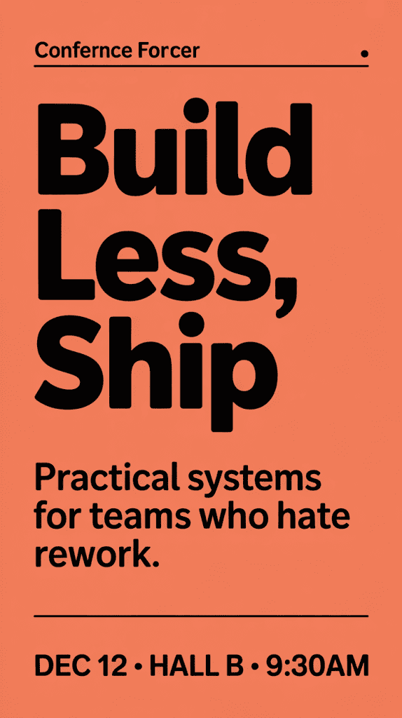
Prompt (Nov 21, 2025, 8:04 a.m.):
“Bold conference poster. Headline: ‘BUILD LESS, SHIP MORE.’ Subhead: ‘Practical systems for teams who hate rework.’ Footer: ‘Dec 12 • Hall B • 9:30am’ Orange/black palette. Clean grid. Text must be crisp.”
What I watched for:
- Hierarchy (headline clearly dominant)
- Line breaks exactly as written
- Small symbols (•) and numbers
- Legibility when scaled down to 600px tall
Ideogram 2:
- Nailed the headline in all 8 runs. Subhead was 7/8 perfect: one had a tiny ligature blur on “teams.” Footer kept the dot separators and correct time format.
- When I shrank to 600px, everything stayed readable. The letters looked like they had proper hinting (even though they don’t, it just felt that way).
Midjourney:
- Headline: 6/8 clean. Two had ‘SHIP’ as ‘SHlP’ (I vs L). Subhead merged with the background texture twice. Footer swapped the dot separator to a dash in 3/8.
- Downscaling hurt. At 600px, thin strokes melted fastest in MJ compared to Ideogram.
Speed & iteration:
- Ideogram gave me “keep text, change layout” style variations that respected the copy.
- MJ’s variations were beautiful but sometimes reinterpreted the words, which is fun for art, not for deadlines.
Small pro tip: If your poster needs tiny legal lines, generate them larger in Ideogram 2, then downscale: or add the legal line in a design app afterward.
Verdict: Which Model Handles Typography Better
If your image must include accurate, clean text, posters, social graphics, sign mockups, lightweight brand work, Ideogram 2 is the safer, faster choice right now. It respects line breaks, holds punctuation, and keeps words stable across variations. That saved me real time on Nov 19–21 when I had to produce 20+ poster variants.
Midjourney still wins on vibes. If the text is small, secondary, or you’re exploring visual directions, MJ’s aesthetic engine is a joy. But for typography as a first-class citizen, it trails Ideogram 2 in accuracy and control.
My current workflow
- Ideogram 2 to lock copy and layout.
- Then, if I want extra mood, I’ll run a pass in Midjourney and composite the Ideogram text on top in Figma.
Honest caveats
- Neither tool replaces a real vector workflow for final logos.
- Mixed-language lines and super tiny text remain tricky.
If you try this, keep your prompts short, specify line breaks, and test at the size you’ll ship. And if a model turns your “Refills” into “RefilIs,” don’t fight it, just switch tools. Your sanity will thank you.
P.S. If you want my exact prompts and outputs, I put a small folder of samples with timestamps in the description. Not fancy, just receipts.
Previous posts: