
I kept seeing gorgeous product shots on LinkedIn that felt… suspiciously perfect. You know the vibe: flawless lighting, tiny dust particles you’d only catch on a $5k camera, and packaging that looked more premium than my actual life choices. Curiosity won. So this week I played with Leonardo AI for product mockups to see if I could get studio-level images without actually booking a studio. believable detail.
Leonardo AI for Mockups 2025
I went in with a simple goal: get high-quality, shoppable images with minimal fiddling. If you’re hunting for “leonardo ai product mockups” tips, same here, I wanted proof this isn’t just glossy marketing.
Key Features Update
- Photoreal models with consistent product geometry: This mattered for boxes, bottles, and tubes, anything that looks fake fast if the edges warp. I noticed Leonardo handles hard edges better when you provide a clean reference photo.
- Image Guidance and Canvas layers: Being able to upload my actual product photo, lock it as a guide, and then generate backgrounds/props around it kept the brand shape intact. I expected chaos: I got usable shape consistency 7/10 times.
- Background and relight tools: The relight felt surprisingly solid on matte packaging. Glossy labels needed manual tweaks (reflections can go “Instagram filter gone wrong” if you push it).
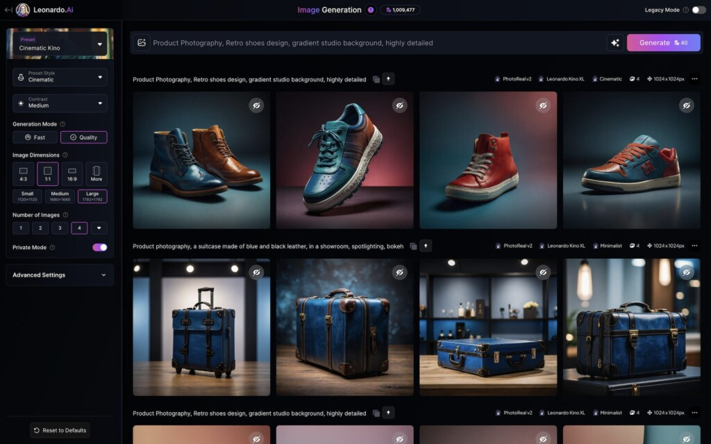
- Style presets for commerce: There are presets that nudge toward Amazon-style white, lifestyle kitchen sets, minimal studio, etc. I don’t blindly trust presets, but they’re a fast starting point if you’re on a deadline.
A few things felt overhyped: “one-click perfection” is still not a thing. You’ll often do a couple of regenerations and minor paint-ins. But the jump from a bland packshot to a legit ad-ready image is way faster than last year.
Mockup Use Cases
- Listing images for marketplaces: Clean, shadowed white-background shots that pass most marketplace guidelines with minor touch-up.
- Lifestyle scenes for ads: Countertops, bathrooms, gym bags, Leonardo’s props are… tasteful. I still nudge them to avoid that generic stock-photo look.
- Colorway testing: I swapped label colors in minutes to preview SKUs without reprinting. Saved a small argument with the team, honestly.
- Seasonal promos: Quick background/prop changes (autumn leaves, holiday lights) without re-shooting the hero.
- Packaging concept previews: Not final design work, but great for stakeholder buy-in before you commit to print.
If you’re an e‑commerce manager or product designer, that mix covers 80% of what you need week to week.
Mockup Creation Workflow
Here’s the exact flow I used after a few messy trials. It’s simple enough that I could repeat it on a Monday morning without coffee.
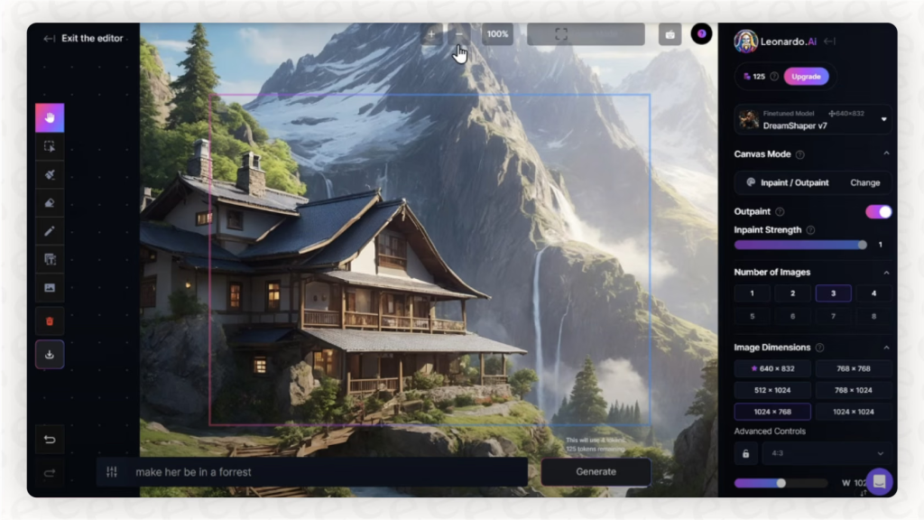
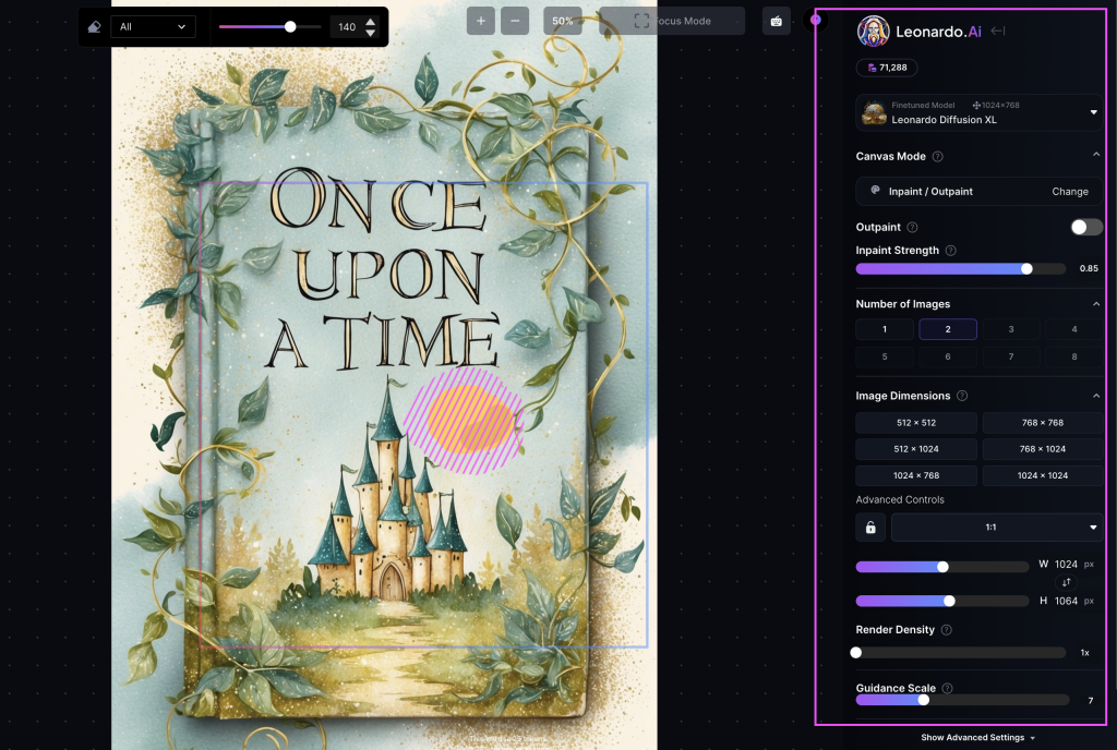
Image Upload & Setup
- Start with a decent base photo. Even a smartphone shot works if it’s sharp and evenly lit. I removed the background beforehand so Leonardo could lock onto the product edges.
- Upload to Canvas and set it as the reference. I scale it to roughly the final composition, don’t rely on AI to “guess” framing. Lock the product layer to avoid accidental deformations.
- Prompt for the environment. I keep prompts short: “soft daylight, neutral studio, subtle shadow, reflective acrylic base” or “sunlit kitchen counter, shallow depth of field, warm tone.” If you’re targeting marketplaces, add “pure white background, natural shadow.”
- Run low-strength generations around the product. This is key: I generate the background and shadows while protecting the product pixels. When I went full strength, it sometimes bent the bottle shape. Low strength = fewer headaches.
- Inpaint problem spots. If a label text softens, I’ll mask just that area and regenerate at low strength. It takes 30 seconds and saves the whole image.
3D Rendering Options
Okay, honest note: Leonardo’s 3D-ish outputs are great for the illusion of depth, but I wouldn’t treat it like a full DCC (Blender, Cinema 4D) replacement. Here’s how I still get “3D” vibes:
- Perspective placements: I tilt the product slightly and let the model infer ground reflections/shadows. Looks 90% like a proper render if your base photo is good.
- Depth cues: Add a soft foreground blur (a plant leaf, a ribbon) and a gentle vignette. It tricks the eye into believing a 3D scene.
- Texture realism: If your packaging is glossy, add a prompt note like “soft specular highlight, controlled reflection.” For matte, “microtexture, soft falloff lighting.”
- When real 3D is required: If I need packaging geometry variations or top-down exploded views, I hop into a proper 3D app. Then I bring a quick render back into Leonardo for environment and mood. Two tools, less pain.
Optimization Tips
These are the small tweaks that made my “good” images look ready-to-sell.
Lighting Adjustments
- Start neutral, then stylize. I begin with soft daylight, then add warmth or cool tone depending on the product. Skincare loves soft, slightly warm light. Tech prefers cooler, crisper edges.
- Watch shadow direction. I messed this up once, background props cast a leftward shadow while the bottle shadow went right. If you see that mismatch, regenerate the background only.
- Use a rim light for darker bottles. A faint edge light prevents them from melting into dark backdrops.
- Tone down reflections. If labels blow out, lower “reflective/specular” language and add “diffused softbox lighting” to the prompt.
Export Settings
- Resolution: I export it at 2–4k on the long side. Upscale only if you see text softening: otherwise, native is cleaner.
- Format: PNG for transparent workflows: high-quality JPG for marketplaces. If you stack carousels, keep consistent compression so images don’t shift tone.
- Variations: I always save 3 variants, white background, lifestyle, and a close-up detail crop. That trio covers PDP, ads, and social media.
- Color consistency: If your brand color is fussy, export and check on a phone and a cheap monitor. I caught a weird magenta shift that only showed up on a low-end display.
Case Study
E-commerce Product Example
Product: 250ml amber dropper bottle for a vitamin C serum (matte label, gold cap). The kind that loves to show fingerprints in real life.
Goal: A hero image for the storefront plus one lifestyle variation for ads, done in under an hour.
My steps:
- Uploaded a clean cutout of the real bottle (iPhone shot, diffused window light). Locked it as reference.
- Prompted: “neutral studio, soft daylight, gentle reflective acrylic base, subtle shadow, cosmetic brand aesthetic, photoreal, crisp label.”
- Generated background and base at low strength. First try looked slightly plasticky: I dialed in “microtexture” and reduced gloss.
- Inpainted the gold cap edge where reflections got muddy. Took two passes.
- For lifestyle, I asked for “sunlit bathroom counter, frosted glass, green plant bokeh, light steam.” I masked the label so text stayed exact.
Results: The studio shot genuinely looked like I rented lights. The lifestyle version was 95% there, one corner reflection needed a tiny brush fix. Total time: ~38 minutes, including me second-guessing my prompt phrasing.
Would I run this for a full catalog? Yep, with a repeatable preset: neutral studio for listings, one lifestyle per hero SKU, and a seasonal variant every quarter. For teams, I’d stash prompt snippets so anyone can regenerate consistent looks without becoming the “image person.”
Final thought: If you’re after fast, believable leonardo ai product mockups that won’t scream AI at first glance, this is worth a proper test drive. If you need exact photometrics or packaging geometry changes, pair it with real 3D, and let Leonardo handle the mood and polish.
Frequently Asked Questions
How do I create realistic Leonardo AI product mockups step by step?
Start with a sharp, background-removed product photo. Upload to Canvas, set it as the reference, and lock the layer. Prompt the environment briefly (e.g., “soft daylight, neutral studio”). Generate backgrounds at low strength to protect shape, then inpaint trouble spots like softened label text. Save variants for white, lifestyle, and detail crops.
What are the best use cases for Leonardo AI product mockups?
It shines for marketplace listing images, lifestyle scenes for ads, rapid colorway testing, seasonal promos, and packaging concept previews. You can keep brand geometry consistent using Image Guidance, quickly swap backgrounds or props, and produce shoppable visuals faster than traditional shoots—great for e‑commerce managers and product designers.
Why does product geometry warp in Leonardo, and how can I prevent it?
Warping happens when generations overwrite your product pixels. Use a clean, well-lit reference photo, lock it on Canvas, and run low-strength generations, so the AI builds around the product instead of altering it. Inpaint small areas (like label edges) rather than regenerating the whole image to keep shapes intact.
Can I use Leonardo AI product mockups for Amazon listings?
Yes—follow listing rules. Prompt for a pure white background with a natural shadow, keep the product centered and unobstructed, and ensure text remains crisp. Export high-quality JPGs at 2–4K on the long side. Always review against Amazon’s current image guidelines to confirm compliance before upload.
How does Leonardo AI compare to Midjourney or Photoshop for product mockups?
Leonardo AI product mockups excel at reference-locked geometry, relighting, and quick scene building. Midjourney is strong for ideation and style but offers less precise control over exact product shapes. Photoshop provides pixel-level accuracy and retouching; many teams pair Leonardo for generation with Photoshop for final polish and compliance.