
I’m Dora. On November 12, 2025, at 10:12 a.m., I opened Ideogram 2 because a client needed a last‑minute holiday banner, and I was already behind on coffee. I figured I’d test the “can it render clean text?” hype on a real deadline, not a sandbox. Fifteen minutes later, I had a headline that didn’t mangle a single letter and a layout that looked like a proper ad, not AI fan art. That little spark, seeing the text come out right on the first try, made me lean in. This isn’t sponsored: just honest results from a week of hands‑on tinkering (Nov 8–14, 2025). I saved screenshots and exports for each pass so you can follow the workflow if you want to replicate it.
Why Use Ideogram 2 for Advertising Design?
I’ve tried most image models for ad visuals, and typography is where they usually break. Ideogram 2 is the first one that consistently treated letters like letters, not spaghetti. For advertising design, where a headline, price, and CTA need to be crystal clear, that’s the ballgame.
Here’s what stood out during my tests:
- Text fidelity: Short headlines and brand names rendered cleanly at least 8/10 attempts. Even tight kerning looked intentional. I saw fewer things like “O” turning into weird shapes.
- Layout intuition: When I asked for “top-left logo, centered headline, bottom CTA,” it respected the hierarchy more often than Midjourney or SDXL, which can still drift.
- Style range: From minimalist tech banners to loud DTC promos, Ideogram 2 didn’t lock me into one vibe. It understood “premium matte aesthetic” vs. “loud retail energy.”
- Speed: Iterations were fast enough to run 3–4 variations per concept and pick a winner.
If you care about brand safety, readability, and quick iteration cycles, Ideogram 2 advertising design actually feels practical. Official docs are light, but the Help Center and blog are decent starting points: help.ideogram.ai and the Ideogram blog announcement for v2.0.
How to Build an Effective Advertising Design Brief in Ideogram 2
The fastest wins I got came from tightening the prompt like a real brief. When I wrote lazy prompts, I got lazy ads. When I wrote like an art director, the outputs clicked.
What I include now by default:
- Audience: who it’s for and what they care about (e.g., “fitness beginners, want simple gear, hate clutter”).
- Offer: the one thing you want them to remember (price, limited time, or benefit).
- Visual hierarchy: logo placement, headline weight, CTA location.
- Brand constraints: colors, type vibe (serif vs. bold sans), tone (playful, premium, calm).
- Format: poster, banner, story, square: size and safe margins.
- Background context: seasonal cues, light/dark, photo vs. illustrated.
A quick example (from my 11/12 test): “Design a holiday promo banner for a direct‑to‑consumer coffee brand. Audience: remote workers, want energy and flavor clarity. Offer: ‘20% off holiday sampler.’ Visual hierarchy: top-left logo, centered punchy headline in bold sans, bottom-right CTA button ‘Shop Holiday Box.’ Brand: deep forest green #103B2B, warm off‑white #F7F3E8, accent copper #C0672B. Tone: premium, cozy, matte. Format: 1200×628, safe margins 60px. Background: soft bokeh lights, shallow depth of field, high contrast between headline and background.” Ideogram 2 followed most of this on the first try.
Key Specs for Posters, Banners, Social Ads, Promos
- Posters (print): 24×36 in or A2: design at 300 DPI. Keep the main text within a 0.5–1 in safe margin. Minimal fine lines.
- Web banners: Common sizes, 1200×628, 1080×1080, 1080×1920. I set safe margins to 5–6% of the shortest edge. Keep files under 2 MB.
- Stories/Reels: 1080×1920. Reserve top 250 px and bottom 250 px for app UI overlays: place the CTA within the lower third.
- Retail promos: If pricing is key, keep the price to 4–8 characters and avoid hyphenation. Ask for a “solid or softly textured background for maximum contrast.”
Small note from my tests: “Logo in vector clarity” won’t magically give you vector, but it nudges cleaner edges. I still replace the logo in Figma afterward for brand‑safe output.
High-Impact Ad Design Prompts for Ideogram 2
These are the prompt patterns that gave me the best yield. Feel free to copy and tweak.
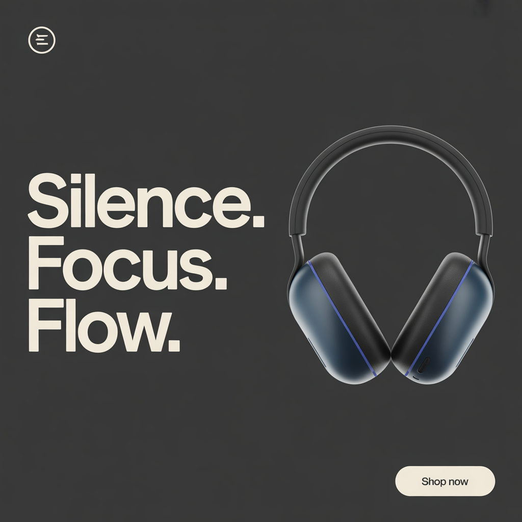
- Product launch hero (clean premium)
“Minimalist poster for a new noise‑canceling headphone. Audience: commuters and remote workers. Headline: ‘Silence. Focus. Flow.’ Bold sans, centered, high contrast. Product photo on the right, soft rim light. Palette: charcoal, off‑white, electric blue accent. Logo top-left. CTA bottom-right: ‘Shop Now’. Format: 1080×1350, 60 px safe margins. Lighting: studio, matte finish.”
- DTC sale banner (high energy)
“Loud retail banner for weekend sale. Offer: ‘40% OFF TODAY ONLY’. Big condensed type, all caps, angled shapes. Palette: black, neon yellow, white. Sticker‑style CTA: ‘Grab the Deal’. Confetti sparsely, not busy. Format: 1200×628. Keep price and CTA readable on mobile.”
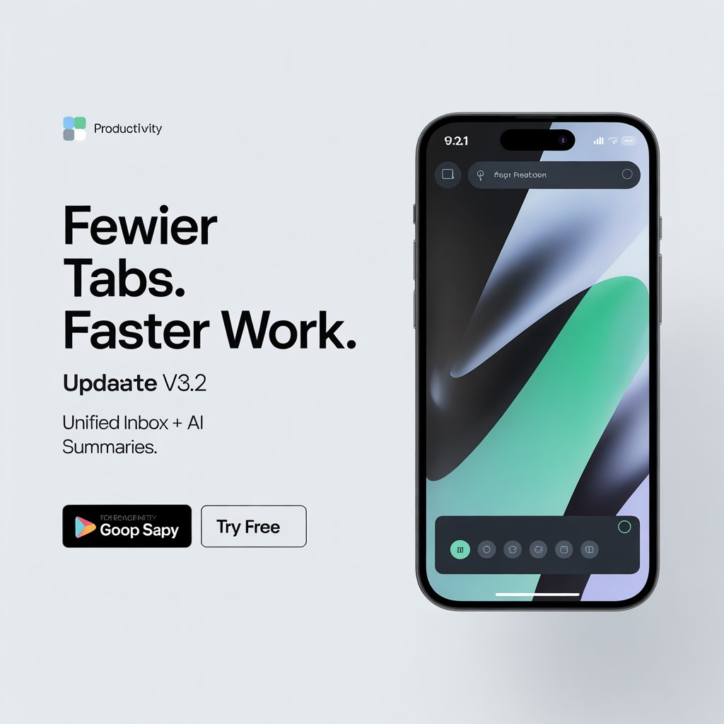
- App feature ad (explanatory)
“Clean, modern ad for productivity app update v3.2. Headline: ‘Fewer tabs. Faster work.’ Subhead: ‘Unified inbox + AI summaries.’ Split layout: left text, right abstract app UI. Palette: cool gray, teal accent. Logo small, top-left. CTA: ‘Try free’. 1080×1080. Flat background, high contrast.”
- Event poster (storytelling vibe)
“Indie film festival poster, cozy cinematic grain. Headline: ‘Midnight Shorts’. Subhead small: ‘Dec 7–9 · Downtown’. Warm tungsten glow, subtle film texture, centered layout, serif headline with strong tracking. 24×36 in, 300 DPI design intent, spacious margins.”
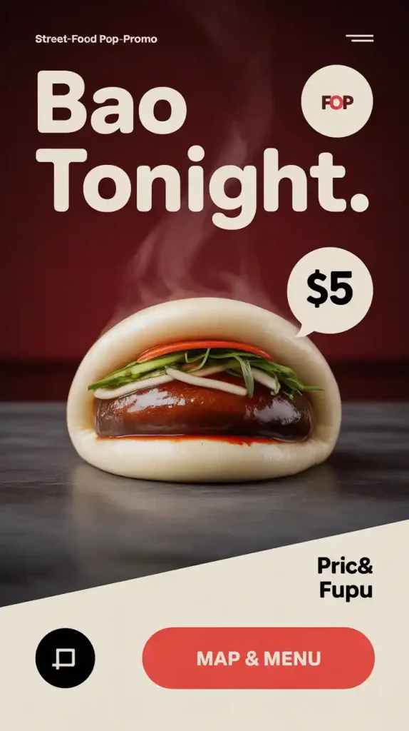
- Food promo (appetite appeal)
“Street‑food pop‑up promo. Headline: ‘Bao Tonight’. Photo‑real bao with steam, glossy highlights. Palette: deep red, cream, charcoal. Diagonal band for price: ‘$5′. CTA button: ‘Map & Menu’. 1080×1920 story, leave top/bottom UI space.”
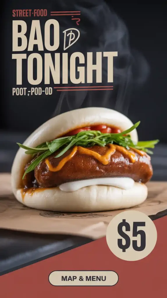
Tip: Add “no misspellings, clean lettering, no decorative distortions” to reduce weirdness. It helped on 11/13 when my “Midnight Shorts” kept turning into “Shortz.”
Tips for Maximizing Text Clarity & Rendering in Ads
What moved the needle for me:
- Keep headlines under 6–8 words. Long lines invite mutations.
- Use quotes around exact phrases: “Write ‘20% OFF’ exactly.”
- Ask for “bold geometric sans” or “high-legibility grotesk” instead of just “nice font.”
- Specify “solid background” or “soft gradient” for contrast. Busy photos make text wobble.
- Avoid hyphenation and slashes in key phrases. They confuse letter shapes.
- Include alignment: “centered headline, left‑aligned subhead.”
- If letters still drift, try: “clean kerning, monoline strokes, avoid outline effects.”
My quickest fix loop: re‑roll 2–3 times, upscale the cleanest, then replace logo/CTA in Figma. On 11/14 at 4:26 p.m., that flow took me 11 minutes from prompt to client‑ready PNG.
Exporting Ideogram 2 Designs for Print vs. Digital Campaigns
Reality check: Ideogram exports as raster (PNG/JPG). For print, I treat it like a visual comp, then finish in design software.
Print workflow (posters, flyers)
- Generate at the largest available size, then upscale 2–4× in Photoshop (Super Resolution) or Topaz.
- Rebuild critical text and logos in Figma/Illustrator so they’re vector‑clean.
- Convert to CMYK in your layout app and soft‑proof. If you must deliver raster, aim ~300 DPI at final size.
Digital workflow (social, banners)
- Export PNG or high‑quality JPG, then compress to stay under platform limits. WebP is great for banners.
- Keep safe margins generous: mobile UI will crop.
- For ad networks, test legibility at 50% zoom. If the CTA fades, bump weight or contrast.
If you want official references, check your print shop’s specs and the Ideogram Help Center for current export options. I’ll keep updating my notes as Ideogram 2 evolves. For now, ideogram 2 advertising design is already good enough to ship faster, and honestly, it’s made the tedious parts feel lighter.
Not sponsored: no affiliate links. Screenshots and test files dated Nov 8–14, 2025, are in my archive, and I’m happy to share redacted settings on request.
Previous posts: