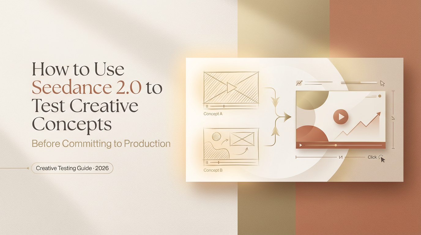
Hey, Dora here. I was staring at yet another half-finished video timeline, when I caught myself thinking: there has to be a faster way to see if this idea is any good. I’d been hearing friends rave about Seedance 2.0 creative testing, so I opened a fresh project and told myself, “Give it two hours. If it helps, great. If not, I’ll go back to my usual chaos.”
The old way: commit first, regret later
My old process was basically faith-based editing. I’d pick a concept, book talent, shoot, edit for days, and only then learn the hard truth: the hook didn’t land, or the visual style felt off, or the CTA was buried. By that point, I’d sunk time, budget, and hope. Changing direction late felt like trying to repaint a house after you’ve already moved the furniture in.
If you’ve ever launched a video and watched the audience retention cliff-immerse the first three seconds, you know the pain. I’ve had “bangers” with gorgeous grades and perfect music that viewers bailed on before the logo even faded. And here’s the part we don’t say out loud: a lot of creative calls get made because we’re rushing, not because we have proof.
That’s what pushed me to try a different path: generate scrappy versions first, put them in front of a small sample, and only go big when the signals are clear. Seedance 2.0 promised exactly that, a way to spin up testable AI video variations fast, learn what works, and then invest in the winners.
What “creative testing” with AI video actually looks like
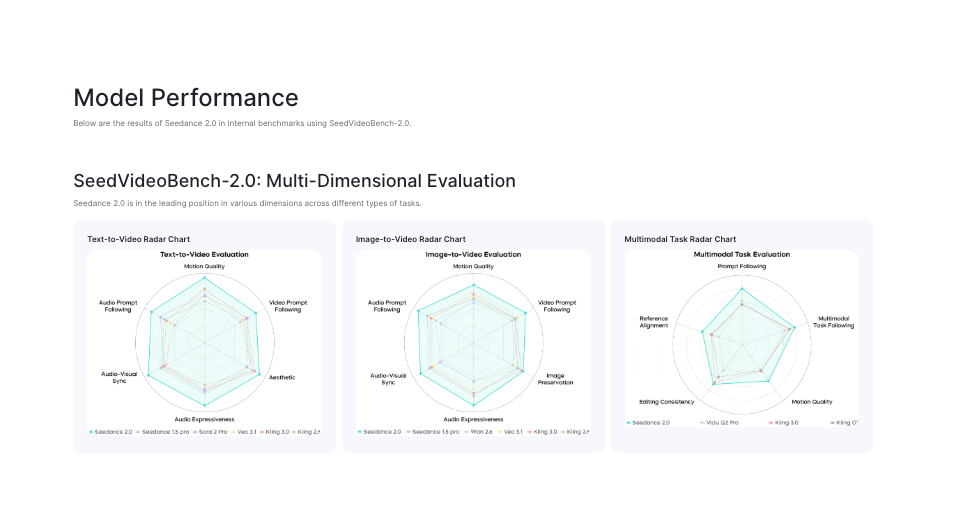
Here’s how my first run went. I set a simple brief: a 20–30 second explainer for a research workflow tool. I wrote three concepts in a doc, then fed them to Seedance 2.0 to generate draft videos. I wasn’t chasing beauty yet, just trying to learn what direction had legs.
- Concept A: “Pain first” hook, start with the moment of frustration and promise relief.
- Concept B: “Before/after” timeline, quick side-by-side of manual vs AI-assisted.
- Concept C: “Surprising stat”, open with a data point and a pattern interrupt.
In Seedance, I kept the inputs tight: target audience, tone (clear, friendly, not salesy), product benefits, and a short brand guide. If you’re new to structuring inputs, I shared a practical breakdown in this Seedance 2.0 prompt engineering guide that walks through how to get cleaner variations. Then I asked for multiple hook options and varied visuals. In under an hour, I had nine draft videos (three per concept) sized for vertical feed. Not perfect, but totally good enough for a test.
I dropped them into two quick testing tracks:
- Organic micro-panel: sent to a small internal Slack group and a tiny email segment (N=137) with a one-question survey: “Which opener kept you watching past 5 seconds?”
- Paid micro-spend: $60 split across three ad sets on Meta, optimizing for 3-second views and link clicks, just to get directional signals.
A few observations that surprised me:
- AI draft pacing: Seedance default pacing leaned fast, sometimes too fast. For B2B-style content, I nudged the beats to breathe a touch more (adding micro-pauses between on-screen text lines). It helped comprehension.
- Visual consistency: I toggled the brand style lock. With it on, everything looked “on-brand,” but some variations felt samey. With it off, I got bolder visual mixes that actually tested creative range better. The happy middle: lock color and type, let layout and motion vary.
- Voiceover clarity: The AI VO was better than I expected… until it wasn’t. For stats or product names, I preferred uploading my own short VO lines. Takes five minutes and avoids odd emphasis.
Generating nine rough cuts this quickly changed how I think about iteration. If you’re building more structured campaign variations instead of single clips, I broke down that approach in this Seedance 2.0 multi-shot marketing video guide.
Once the drafts were out, I watched the early numbers roll in. My tiny panel voted 57% for Concept B’s opener. The paid test backed it up: Concept B averaged a 3-second hold of 74% vs 61% (A) and 58% (C). CTR on the same landing page nudged higher with B too (2.9% vs 2.2% for A). Directional, not definitive, but enough to stop me from overproducing the wrong horse.
Concept test vs polish test
I learned there are really two kinds of testing here, and mixing them muddies the water:
- Concept test: You’re validating the big idea and the hook logic. Don’t worry about perfect lighting or buttery transitions. You need clarity, not gloss. I ran this with very light branding and multiple hook lines per concept.
- Polish test: Once the concept wins, you tune details, motion cadence, color contrast, sound design, subtitle style, CTA timing. This is where you A/B small elements to squeeze out extra engagement. Seedance 2.0 made it easy to swap polish elements in batches.
When I kept these phases separate, decisions got simpler. When I mixed them, I found myself arguing with myself about music taste while I should’ve been asking, “Is this even the right story?”
3 things worth testing before full production
You can test dozens of knobs, but three gave me the biggest signal-to-effort payoff.
Hook format, visual style, CTA placement
- Hook format
What I tried:
- Pain-first line vs surprising stat vs direct promise.
- Pattern interrupt in the first 0.8s (hard cut + bold text) vs a gentle ramp.
What happened:
- The “before/after” split-screen opener consistently earned the strongest 3-second hold in my set. It also made the rest of the script easier because viewers instantly knew the stakes.
- The stat hook worked only when the number was truly jaw-dropping, and I animated it with a quick punch-in. Otherwise, it felt like a slide deck.
Tip: In Seedance 2.0, ask for three hook families and at least two pacing options per hook. Keep VO the same, only change the opening beat. You’ll isolate what actually drives early retention.
- Visual style
What I tried:
- Clean product UI screens with light motion vs stylized mockups with texture.
- Minimalist color blocking vs playful gradients.
What happened:
- For a productivity tool, simple UI close-ups with crisp micro-animations outperformed artsy treatments. People wanted to “see the thing” working. On a different test (Feb 16), where the product was more lifestyle-y, stylized shots did fine.
Tip: Lock brand colors and legibility (subtitle contrast, font weight). Then let motion and composition vary. If your UI is dense, try a progressive zoom with callouts, it reads better on small screens.
- CTA placement
What I tried:
- Early CTA tag at 6–8 seconds vs mid-roll at ~15 seconds vs end-card only.
- On-screen button-style graphic vs verbal ask only.
What happened:
- Mid-roll CTAs performed best in my paid test: 3.1% CTR with a quick visual button at 14s vs 1.8% early and 2.2% end-only. My theory: viewers needed a bit of context before they were ready to click, but asking too late missed the scrollers.
How to read the results (what a good test tells you)
A good test doesn’t hand you a trophy: it narrows the field.
Here’s my quick read framework from the set:
- 1-second hold (thumb-stop): If this is low, your first frame isn’t doing its job. Change visual contrast or movement, not just the line.
- 3-second hold: This is your hook health. If it’s strong but watch-through dies at 5–10 seconds, your setup is muddy. Tighten the bridge line.
- 50% watch-through: This tells you pacing and clarity mid-video. If it’s solid but CTR is weak, your CTA isn’t clear or doesn’t match the promise.
- CTR on identical landing page: If CTR rises with concept B vs A while impressions are similar, the story itself is making people curious.
A tiny spend (I used $60) won’t predict your entire campaign, but it will weed out bad bets and highlight patterns you can trust. Also: look for agreement across sources. In my case, the internal panel vote and the paid micro-test both pointed to the same opener. That’s enough signal to move forward.
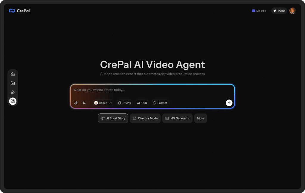
One thing I didn’t expect after running these tests: once you start generating multiple variations, files and versions pile up fast. Now, our Crepal is a good choice.
You can use it to keep image, video, and audio drafts in one place, track different creative versions, and avoid the “final_v7_real_final.mp4” chaos that happens during testing cycles.
When to stop testing and start producing
My rule of thumb after this week: stop when you get repeating winners.
Here’s what that looked like for me:
- Two rounds show the same hook family on top.
- Mid-roll CTA beats early and late twice in a row.
- Visual style that highlights real UI keeps winning over abstract motion.
At that point, I lock the script, upgrade assets (custom VO, cleaner UI captures, better SFX), and use Seedance 2.0 to regenerate the exact same winning structure, just prettier. If you keep testing past that, you’re probably fishing for taste validation, not learning.
One last nudge from me-as-a-friend: if Seedance 2.0 helps you find your winner, don’t overcomplicate the final. Keep the bones that tested well. Swap the drywall, not the floor plan.
Previous posts: