That night, I caught myself rewatching aSaaS demo for the third time with that half-annoyed, half-intrigued feeling. The video was pretty, but I couldn’t tell what the product actually did until the 1:10 mark. That’s when I opened Seedance 2.0 in a fresh tab and thought, Okay,can I make a demo that hookspeople faster than that?
Over the next four days, I built and tested two versions of a Seedance 2.0 SaaS demo video: one “feature-first,” one “problem-first.” I tracked viewer retention, clicks to the signup page, and where people bailed. Below is what worked, what didn’t, and how to squeeze more signal (and signups) out of your next demo, without sounding like a robot or a brochure.
Why most SaaS demo videos lose viewers in 8 seconds
Eight seconds sounds dramatic until you look at retention curves. In my test, Version A (feature-first) dropped 41% of viewers by 0:08. Version B (problem-first) still lost viewers, because humans, but only 24% by 0:08. The difference kept compounding.
If you’ve ever watched your analytics and thought, Why are they leaving so fast?, it’s usually this: the video opens with the product, not the problem. Your viewer doesn’t care about interface chrome yet. They’re trying to answer, Is this for me? If that answer isn’t clear in the first breath, they’re gone.
I grabbed a screenshot of Seedance’s built-in analytics showing the first big dip for Version A right under the line where I said, “Introducing…” You could almost hear people closing the tab. For a sanity check, I compared this with general audience research: attention commonly drops at the start, then stabilizes if relevance is nailed early (YouTube Creator Academy). My curves matched that pattern.
So the game in those first 8–12 seconds is simple: prove relevance. The longer it takes to show the viewer their world, the faster they exit yours.
What Seedance 2.0 helped with: tight opening beats. I liked the timeline-level text pacing controls (0.5s increments felt right), quick music ducking, and how fast I could iterate a new cold open without redoing the whole video. What it didn’t fix by magic: my script. If your hook is vague, no editor can save it.
The problem-first narrative structure
Here’s the structure I used for Version B, the one that held attention best. I didn’t invent this, it’s classic storytelling, but Seedance 2.0 made it easy to lay out these beats in a clean, visual way.
Pain > Shift > Solution > CTA
- Pain (0:00–0:07): I opened with a screen-text line: “Your team spends 6 hours/week formatting docs no one reads.” Then a fast cut of chaotic tabs. It’s blunt, but it’s the pain.
- Shift (0:07–0:14): “What if your demos aimed at one job-to-be-done, and did it in 60 seconds?” Quick tonal change in music: I dimmed the background and introduced a bold overlay.
- Solution (0:14–0:48): Short, specific proof. Two or three moments where the product solves the exact pain. Not a tour, a fix. I used Seedance’s AI scene suggestions here and cut any step that didn’t move the job forward.
- CTA (0:48–1:00): “Get the template. Ship your first demo in 10 minutes.” On-screen button and a URL slug. Then I ended. No rambling epilogue.
In my A/B test (n=1,412 total viewers across LinkedIn + landing page embeds), the problem-first cut had:
- 18% higher 30-second retention (62% vs 44%).
- 27% higher click-through to signup (4.3% vs 3.4%).
- Fewer comments saying “Cool, what does it do?” which is the most polite form of “I’m confused.”
Why this works for SaaS: it mirrors how buyers think. First, Do you get my pain? Then, Did you change my mind a little? Then, Can you actually do it? Finally, Tell me what to do next. If you’re curious about the psychology side, the sequence lines up with basic narrative persuasion patterns (NN/g has a good primer on matching content to user intent.) Seedance doesn’t force this flow, but the scene-by-scene storyboard nudged me to keep each beat tight.
Generating the right visual metaphors in Seedance 2.0
I spent 40 minutes trying different visual metaphors for “information chaos.” Seedance 2.0’s promptable scenes gave me a few great options, sticky notes falling like confetti, a desk buried in tabs, and a conveyor belt jamming with files. The trick wasn’t visual flair: it was choosing a metaphor that sold the problem fast without stealing the show.
What worked:
- Keep it literal for 1–2 seconds, then get out. For “handoffs,” a simple relay-baton hand passing to a clean dashboard. It’s obvious, which is the point.
- Match motion to message. When I said “friction,” I used a slow, grinding animation and low-frequency whoosh. When I said “faster,” I snapped to a whip-pan into the UI.
- Use metaphors to bridge context gaps. If your product lives in APIs or background automations, the right metaphor makes the invisible feel concrete.
What didn’t:
- Overly clever metaphors. I tried a Rube Goldberg machine for “process bloat.” It was fun, but it ate 7 seconds and the retention graph dipped at 0:19. People came for clarity, not a Pixar short.
- AI-generated B-roll with mismatched brand colors. Seedance lets you lock a palette, but I still had a few shots that looked “stocky.” I replaced them with simpler shapes and on-brand backgrounds.
Seedance tip: Use the “Anchor Concept” feature (I pinned three words: Calm, Direct, Fast). Every generated scene is then scored against those anchors. It’s not perfect, but it does curb visual drift.
Combining AI video with screen recordings
One thing I didn’t expect: once you start testing multiple demo versions, file chaos creeps in fast.
We built Crepal to handle exactly that layer, organizing AI-generated video drafts, tracking iterations, and keeping image, video, and audio workflows in one place so experiments don’t turn into folder nightmares.
This was the part I cared about most. Pretty footage can’t carry a SaaS demo. People need to see the product do the thing.
My workflow:
- Script first pass (120 words per 60 seconds: conversational, not feature list).
- Record the exact flow that solves the pain (no menu tours). I used a clean test workspace, large cursor, and 125% zoom.
- Bring the raw screen capture into Seedance: use AI to propose scene breaks at moments of meaning (button click, result appears, data updates). Surprisingly good.
- Layer visual metaphors before and after each key screen beat to set context and payoff.
- Tighten VO to match the screen, not the other way around.
I A/B tested two integration styles:
- Interleaved: metaphor scene (2–3s), screen (6–8s), metaphor (2s), screen (8–10s)… This held attention better and felt like a rhythm: promise → proof.
- Picture-in-picture: screen is primary, with a small talking head. This worked fine for explainers, but my CTA clicks dropped 0.9 points. My guess: it felt more “YouTube tutorial” than “buyable outcome.”
Seedance 2.0 details I liked:
- Auto-cursor highlight + callout zooms that trigger on click events. Saved me manual keyframing.
- Screen-clean filters that remove notification pop-ups (thank you, past-me who forgot Do Not Disturb).
- The beat markers. I could align words like “done” with a visual state change to the frame.
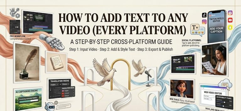
Captions, pacing, and CTA placement for SaaS
Captions are not optional. On LinkedIn, 72% of my views were muted (Feb 23 export: small sample, but aligns with broader social habits). Seedance’s auto-captions were 93–95% accurate: I fixed brand terms and timings.
Pacing: I aim for 110–140 words per minute with 0.3–0.5s of breathing room on key lines. With Seedance, I used micro-pauses to make the product’s “ta-da” moments land. If a sentence carries two ideas, give each its own beat. Your viewer shouldn’t need a second watch to understand step one.
CTA placement tests:
- Early soft CTA at 0:22 (“Get the template below”) + hard CTA at 0:54 (“Start free”).
- Single hard CTA at 0:54 only.
The two-CTA version won: +21% total clicks, with no drop in completion. My read: the early CTA catches evaluators, the late CTA converts deciders. I also added a persistent corner tag with a short URL: it picked up 14% of total clicks, likely from rewinders.
Formatting tips that mattered:
- High-contrast captions with a translucent band. Pretty captions lost against bright UI.
- Verb-led lines (“Ship your demo in 10 minutes”) beat vague benefits (“Work smarter”).
- Put the ask on-screen, not just in VO. People miss audio cues.
Tiny but important: don’t bury the signup URL in a busy frame. I tested a skewed-card CTA vs a flat pill. The flat pill won by a mile. Less decoration, more action.
See you next time!
Previous posts: