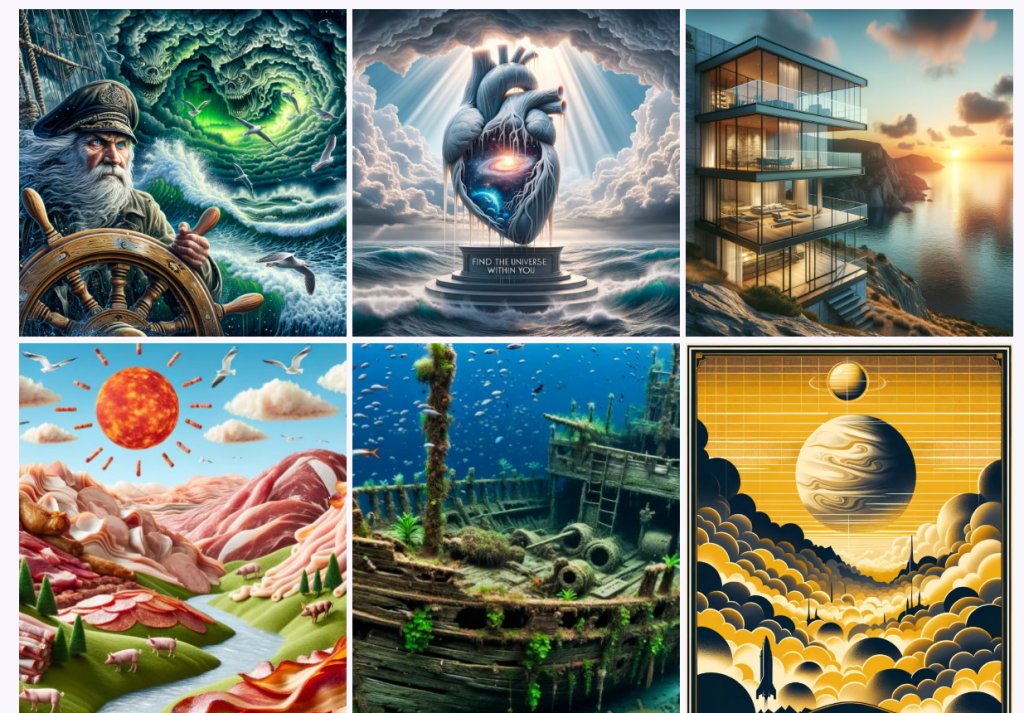
Hey, I’m Dora. I fell down the rabbit hole after a tiny frustration: I generated a “character” I liked for a blog header, went to make a second image…, and the face looked like his distant cousin. Cute, but not helpful. That’s when I decided to really chase AI image consistency, which keeps a look stable across a whole set, and what quietly messes it up.
Tools I reference here are the ones I use most: Midjourney V6 (features available as of Nov 2024), Stable Diffusion SDXL (Automatic1111 + ComfyUI), DALL·E 3 (no seed control), and Adobe Firefly 2. If you use something else, the principles still apply.
Why AI Image Consistency Matters
Consistency isn’t just an artsy preference. It’s the backbone of:
- Brand identity: Same character, same vibe, across web pages, pitch decks, and ads.
- Workflow sanity: You don’t want to redesign a thumbnail template because the model drifted the palette.
- Faster iteration: When the baseline is stable, you can tweak tiny details instead of starting over.
In practice, AI image consistency comes down to managing three things:
- Variables (seed, composition, lens/focal length, aspect ratio). The more fixed they are, the more repeatable your results.
- References (style, character, structure). These act like guardrails.
- Color and light. If those drift, even the same character feels different.
I learned this the hard way, my “series” looked like it was drawn by a committee. Once I locked the right variables, the images finally looked like they belonged to the same world.
Prompt Techniques for Consistent AI Images
- Lock a seed when the tool allows it
- Midjourney: add “–seed 1234” to your prompt once you like the style, then vary with small edits.
- Stable Diffusion: set a fixed seed: keep sampler/scheduler and steps the same between runs.
Seed is your random-number anchor. Without it, every “same” prompt is a new roll of the dice.
- Standardize the camera and frame
Add specifics that behave like technical settings:
- “35mm lens, f/2.8, shallow depth of field, head-and-shoulders portrait, centered composition, 3:4 ratio.”
- For product sets: “three-quarter angle, 50mm, studio backdrop, 1:1.”
When I stopped saying “portrait” and started saying “35mm headshot, 3:4,” my character’s face shape stopped drifting as much.
- Use style and character references instead of adjectives
Adjectives like “cinematic, moody, editorial” are fine, but they’re squishy. References are firmer.
- Midjourney V6: “–style reference [image URL]” for broader look: “–cref [image URL]” for character face/hair consistency.
- Stable Diffusion: IP-Adapter or Reference Only nodes in ComfyUI: “adetailer” or “controlnet openpose” for pose stability.
- Firefly 2: Style reference + Structure reference (great for layouts and product scenes).
- Describe repeatable features, not plot twists
Instead of “a woman smiling,” pin features: “oval face, warm brown eyes, shoulder-length wavy black hair, small gold hoop earrings.” Keep this block identical across prompts.
- Save the exact prompt blocks you reuse
I keep a small “consistency snippet” that includes lens, ratio, color palette, and the character bio. When something finally works, don’t trust your memory, save it and paste it verbatim next time.
Lighting & Color Matching for Stable Results
Lighting is the sneaky villain. Same face, different light = different mood. Here’s what keeps images in the same universe:
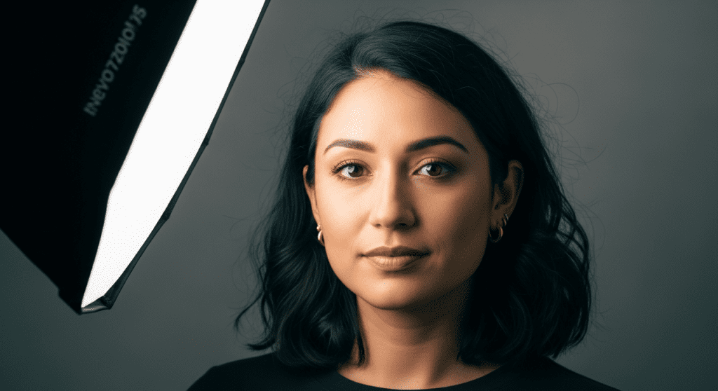
Lock the light setup
- Use studio-like phrasing: “softbox key light 45° camera left, subtle rim light, neutral gray backdrop.”
- For outdoor sets: choose a time of day and stick to it: “golden hour, backlit, long soft shadows,” or “overcast noon, diffused light.”
Set a color palette on purpose
Name three to five hex colors or well-known palettes: “muted teal (#2d6a73), sand (#d6c4a2), charcoal (#333), with warm skin tones.” Adding a simple LUT-style line helps: “Kodak Portra-like film tones” or “teal-and-orange grade, mild.”
White balance and background
“Neutral white balance, 5600K” or “warm 4500K indoors.” For backgrounds, lock a material: “paper seamless,” “concrete wall,” or “matte pastel gradient.” Tiny backdrop changes read as big style shifts.
Post-pass harmonizing
If your toolchain supports it, run a batch color grade:
- Stable Diffusion: apply the same LUT or color curve in a post node.
- Any workflow: finish in Lightroom/Photoshop with a synchronized grade. One shared preset can glue a set together.
Once I started tagging color temperature and adding a mini palette, my “same character” finally felt like the same campaign.
How to Use Variation Tools for Consistency
Variation tools are your scalpel. Use them to change only what you mean to change.
Midjourney
- Vary (Region): redraw a bounded area without wrecking the whole image. Great for swapping outfits while keeping the face.
- Remix Mode: nudge the prompt with the same seed. Think “small steering corrections.”
- Character Reference (–cref): strong for face/hair identity across scenes: pair with a fixed seed for best results.
Stable Diffusion SDXL
- ControlNet OpenPose: locks body pose. Depth/Normal controlnets stabilize structure.
- IP-Adapter Face/Plus: imports identity from a reference photo. Keep weight consistent (e.g., 0.7) across images.
- Inpainting with the same seed + masked area lets you fix only what changed.
DALL·E 3 and Firefly
- DALL·E 3 has no seed control. Use “Generate variations” on your best image and feed the chosen image back as a reference in the next prompt. Consistency is possible, but it’s more coaxing than control.
- Firefly 2’s Structure + Style reference is surprisingly steady for product grids and UGC mockups.
My rule: vary the smallest thing first (region, pose, outfit). If you change prompt, seed, ratio, and lighting at once, any consistency you had will vanish.
Batch Workflow Tips for Consistent AI Image Sets
Here’s the simple loop I use when I need 8–20 images that all match:
- Build a locked base
- Write a “base prompt” with character bio, lens/ratio, lighting, palette, and background.
- Generate 4–8 options, pick the best, and extract its seed and settings. That becomes the master.
- Work in controlled batches
- Duplicate the master prompt into a doc. Change one variable per row: pose, prop, or location.
- Keep seed fixed when you can: if you must change the seed, change nothing else in that run.
- Track your settings like you mean it
- Midjourney: note seed, version, aspect ratio, style/character refs.
- SDXL: note seed, sampler, steps, CFG, ControlNet models, IP-Adapter weights.
- Save filenames with settings in them: projA_char1_seed1234_poseA.jpg. Future-you will say thanks.
- Approve with contact sheets
Export a 3×3 grid to compare skin tone, contrast, and framing at a glance. If one tile pops out, it’s probably lighting or palette drift.
- Final glue step
Run a shared color grade, crop to the same aspect, and align margins. This last 5% is what makes a collection look intentional.
If you want a quick prompt starter, here’s a template I reuse:
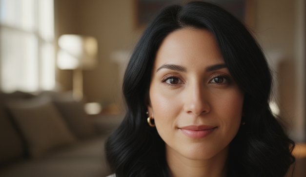
“female product designer, oval face, warm brown eyes, shoulder-length wavy black hair, small gold hoops, minimal makeup, 35mm lens, f/2.8, head-and-shoulders, 3:4, softbox key light 45° left, subtle rim light, neutral gray seamless, neutral white balance 5600K, muted teal (#2d6a73) and sand (#d6c4a2) palette, mild filmic grade, crisp yet soft skin texture.”
It’s not magic, but it gives you a stable spine to build a whole set.
If you want my saved prompt snippets and a one-page consistency checklist, ping me. I’m happy to share. And if you’ve found a better trick for AI image consistency, please tell me, I’ll try it tonight.
Previous posts: