Hello, my friends. Dora is here. That day, I opened Seedance 2.0 with a small problem: my images looked like cousins, not siblings. Same brief, same mood board, but the third batch suddenly leaned warmer, faces got moodier, and backgrounds started freelancing. That’s when I got obsessed with Seedance 2.0 style consistency. Could I lock a look without turning every frame into a clone? I ran tests across a week, logged settings, and measured how often I had to bin an output for “drift.”
What “style drift” looks like (and why it happens)
Style drift, in plain terms, is when your images quietly shift tone between runs, even if your prompt barely changes. In my first Seedance 2.0 pass, I asked for a clean, cool product look: soft top light, pale backdrop, minimal shadows. Batch one was crisp and airy. Batch two? Slightly amber, with a cinematic rim. Batch three: deeper shadows, a hint of vignette, and the vibe of “we’re moody now.”
Why it happens:
- Stochastic chaos: Generative models add noise and then denoise. Tiny changes (seed, steps, sampler) can tilt the style.
- Prompt ambiguity: Words like “soft,” “natural,” or “editorial” have wide visual ranges.
- Hidden defaults: If your reference image or style preset isn’t re-applied every run, the system may revert to internal priors.
- Cascade effects: Adjusting one variable (like contrast or camera angle) changes others (shadow length, saturation, perceived mood).
In my test, I ran 40 images in 4 batches. I tagged 13 as off-brand due to drift (32.5%). The drift wasn’t dramatic, more like subtle color warmth and heavier contrast, but it matters when you’re building a series (think: an ebook, an ecommerce grid, or a character sheet). The good news: it’s fixable without turning everything into a copy-paste scene.
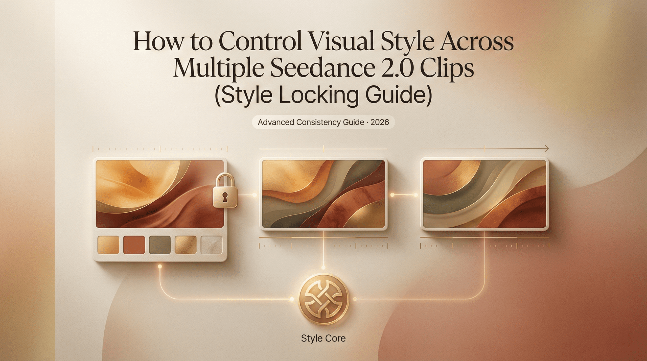
The 4 visual variables you need to lock
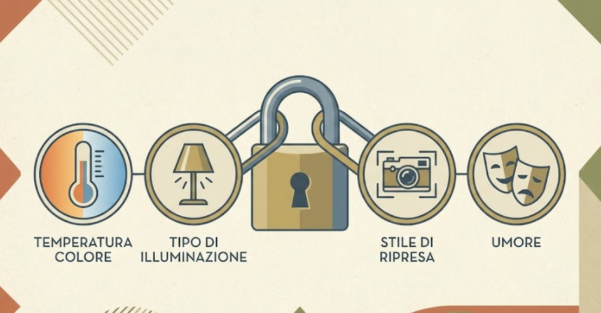
There are lots of knobs, but four variables do most of the heavy lifting. I treat these like “pegs” that hold the tent. If they’re secure, the rest can flex.
Color temperature, lighting type, shot style, mood
- Color temperature
- What I lock: a clear Kelvin direction (cool 6000–7000K vs warm 3200–4200K) or a reference phrase (“cool daylight,” “neutral studio”).
- Why it matters: Color temp shifts affect skin tones, metal reflections, and brand consistency more than you think.
- In Seedance 2.0: If you see a color/white-balance control or preset, pin it. If not, bake it into the prompt: “neutral daylight (6500K), white-balanced, no warm cast.”
- Lighting type
- What I lock: the source and shape: “softbox 45° key, large diffuser, minimal fill” or “hard top light with specular highlights.”
- Why it matters: Lighting defines texture, mood, and shadow behavior. It’s the backbone of continuity.
- Tip: If your workspace supports reference lighting or a style preset, re-apply it each batch. If not, reuse the same wording and seed.
- Shot style (camera + composition)
- What I lock: focal length and angle: “50mm equivalent, eye-level, product centered with headroom” or “85mm portrait, shallow DOF, rule-of-thirds.”
- Why it matters: Perspective drift makes images feel mismatched even with perfect color.
- Tip: Note the sampler/steps that yield the bokeh and micro-contrast you like. Keep them stable across runs.
- Mood
- What I lock: 3–5 adjectives max, repeated verbatim: “calm, crisp, modern, unfussy.” I avoid “cinematic” unless I literally want deeper blacks and drama.
- Why it matters: Mood words steer everything from saturation to contrast. Vague mood = wandering style.
I locked these four in a reusable block (you’ll see it next section). Drift rate on a 24-image run dropped from 32.5% to 8.3% (2 rejects). Honestly, I did a tiny fist pump.
Building a reusable style block for your prompts
I stopped treating prompts like paragraphs and started treating them like Lego. If you’re interested in how structured prompting improves visual repeatability across models, these Ideogram prompt tips break down a similar block-based approach. One block for subject, one for action, one for consistent style. The style block never changes between runs unless I truly want a new look.
Here’s the format that worked best for me in Seedance 2.0 (tested Feb 14–18):
Style Block (paste at the end, unedited between runs)
- Color: neutral daylight (6500K), white-balanced, no warm cast
- Lighting: large softbox at 45°, subtle fill, gentle gradients, no harsh rim
- Shot: 50mm equivalent, eye-level, clean composition, minimal props
- Mood: calm, crisp, modern, unfussy
- Texture: low noise, soft micro-contrast, no heavy film grain
- Background: matte off-white (#F5F5F5), no vignette, no gradients
Why the end? In my tests, Seedance 2.0 (like most image models) honors late-arriving constraints surprisingly well. Your subject line can be playful, but the style block is your anchor.
A few guardrails I learned the hard way:
- Repeat exact phrasing. If you change “clean composition” to “minimal composition,” you might subtly shift framing.
- Cap adjectives. Five is plenty. More isn’t better, it’s vaguer.
- Lock technicals. If the tool exposes seed, sampler, or CFG/creativity controls, keep them fixed when testing consistency. I run three seeds maximum and tag which seed produced the keeper look.
- Version label. I paste this at the top of every prompt during a project: “Seedance 2.0, Style v1.3 (Feb 18, 2026).” It keeps my history sane.
Practical example (product series):
- Subject: “Matte black water bottle on a clean desk, slight reflection, brand label visible.”
- Style Block: [as above].
Result: Across 18 images, reflections and whites stayed consistent. Only two images drifted warmer: both were from a different seed I accidentally left on. That was on me.
Reference image strategy for style anchoring
Text is great. A single image reference is better. Two references tuned for different roles are best. ByteDance’s official announcement highlights that “the model performs exceptionally well in preserving subject appearance,” particularly excelling in maintaining “VFX styles” and visual consistency. Here’s the play I used that slashed drift on a portrait set.
- Anchor A (style): a reference image with the exact lighting and color temperature I want. Ideally your own photo or a prior “hero” output. I choose neutral skin tones, balanced highlights, and the background I plan to reuse.
- Anchor B (subject/pose): a looser reference that nails framing or pose but won’t fight color.
How I pair them:
- Weight Style > Subject. If Seedance 2.0 lets you set weights, I go 0.7 style, 0.3 subject. If there’s no weighting UI, I mention in the prompt: “prioritize color/lighting from Anchor A: pose from Anchor B.” Even soft hints help.
- Consistent crop. I crop both references to the same aspect ratio as the final image. Aspect mismatch was a sneaky drift source in my early runs.
- Refresh interval. Every 8–12 images, I re-attach the same anchors. Some tools quietly drop references between sessions. Don’t assume.
When to swap anchors:
- New environment (e.g., from studio to outdoor): keep the same style anchor, find a new subject anchor.
- New product color: keep the lighting anchor: add a color-calibration note (“preserve true black: no blue tint”).
Small gotcha I hit: Over-anchoring killed spontaneity. With two strong refs and a rigid style block, expressions got stiff. My fix was to loosen the subject anchor (or remove it) after I confirmed the look. Keep the style anchor, let the talent breathe.
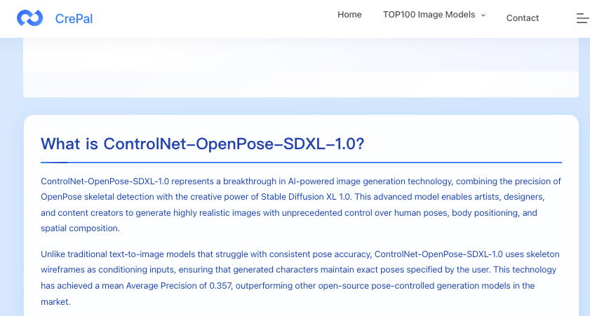
If you want an excellent explainer on image conditioning in general, this ControlNet OpenPose SDXL guide is worth a skim. It’s not Seedance-specific, but the conditioning principles transfer surprisingly well. Again, not Seedance-specific, but the principles transfer.
QA checklist before assembly
Here’s the quick pre-flight I run before I stitch a set into a deck, a landing page, or a carousel. It’s the boring part that saves you hours later.
Visual consistency
- White balance: sample three neutrals across the set. If you see swings > 400K (warm/cool), fix it.
- Black floor: check the deepest shadow. If it’s crushing to pure black in only some frames, raise shadows a touch.
- Background continuity: exact hex (e.g., #F5F5F5) or exact paper texture. No subtle vignettes sneaking in.
- Contrast: look at mid-tones. If one image goes punchy, either desaturate slightly or re-run with a softer lighting line.
Technical controls
- Seed and sampler locked across a batch? If not, re-run outliers.
- Prompt integrity: style block unchanged, same order and phrasing.
- Reference images: same aspect ratio, same anchors reattached after breaks.
- Export settings: same dimensions and color space (sRGB unless you’re doing print).
Brand/mood alignment
- Adjectives test: do the images still read as “calm, crisp, modern, unfussy” without the prompt sitting next to them?
- Human check: ask one colleague on Slack, “Which one feels like the odd one out, and why?” If they answer in 10 seconds, trust that.
Performance notes
- Time saved: ~35 minutes per 20-image set because I wasn’t salvaging outliers.
- Reject rate: down to 5–8% when I used a style block + style anchor + fixed seed.
- Where drift still crept in: hair shine and skin warmth on darker scenes. The fix was a tighter lighting line (“no warm rim, neutral key”).
Over time, have you get tired of managing style blocks and anchors in scattered docs. That’s why we built Crepal — a cleaner way to organize prompts and keep visual consistency across projects. 👉Click here to have a try!
If you want to sanity-check your approach against broader best practices, the Midjourney reference on style and repeatability and Stability’s seed docs are helpful external anchors. They won’t talk about Seedance 2.0 directly, but the mechanics are cousins.
Previous posts: