I stayed up until 2 AM the night GPT Image 2 dropped — not because I planned to, but because I kept telling myself “just one more test.” That’s the thing about a genuinely interesting model update: you can’t stop poking it.
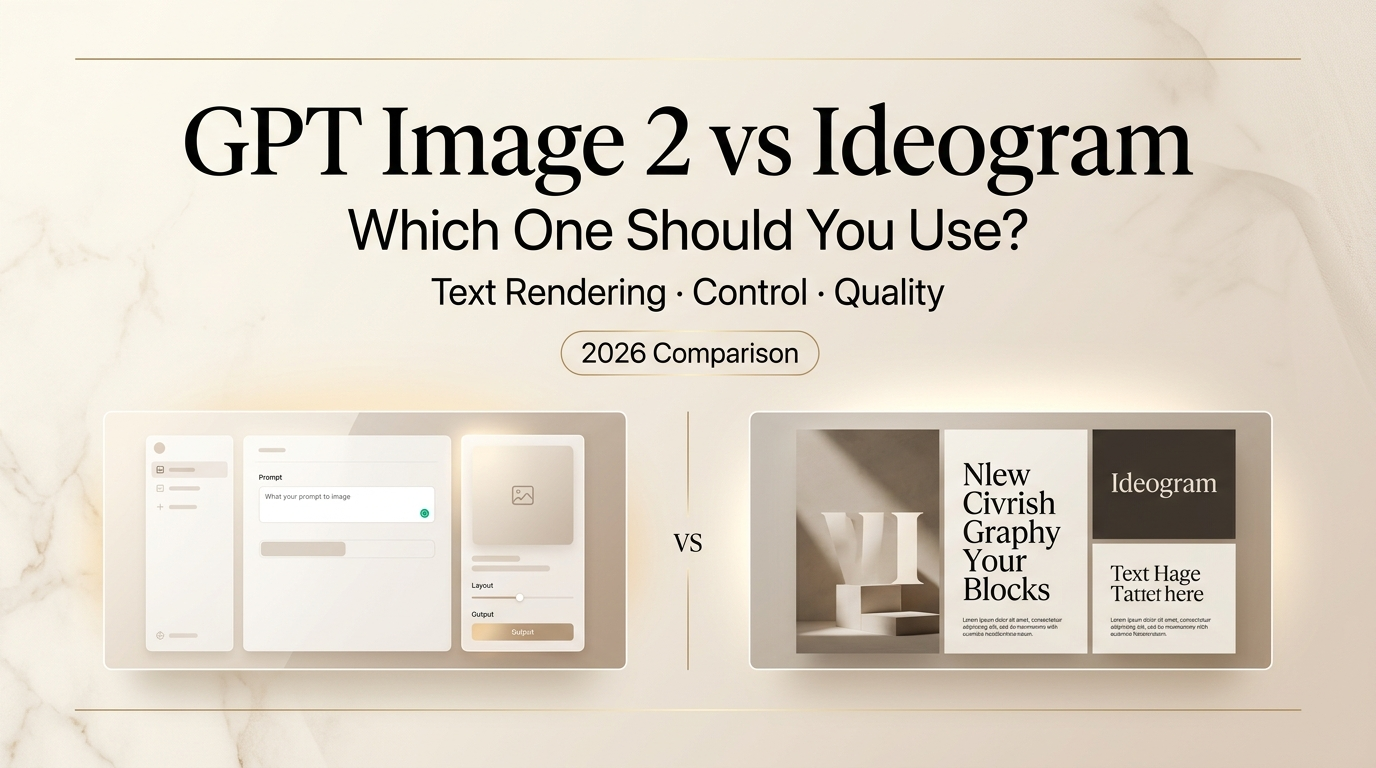
I’ve been using Ideogram since the early days. It became a staple of my workflow specifically because nothing else could put readable words inside an image without producing garbled nonsense. So when OpenAI’s ChatGPT Images 2.0 landed with claims of “near-perfect text rendering” — I had to find out whether Ideogram had just met its match, or whether this was another case of marketing hyperbole.
Hey there, it’s Dora. After a week of side-by-side testing — posters, social graphics, UI mockups, infographics — here’s what I actually found.
What GPT Image 2 and Ideogram Are Best At
Before getting into the head-to-head, it helps to understand what each tool was built for, because they genuinely come from different places.
GPTImage 2 (officially gpt-image-2, released April 21, 2026) is natively baked into the GPT-4o architecture. It’s a generalist model with reasoning built in — OpenAI describes it as a model that can plan, self-check, and search the web before rendering a single pixel. The “thinking mode” version can produce up to eight coherent images from one prompt. It does photorealism, complex scenes, UI mockups, and multi-panel layouts. Text rendering used to be its weak spot. With this version, that story changed.
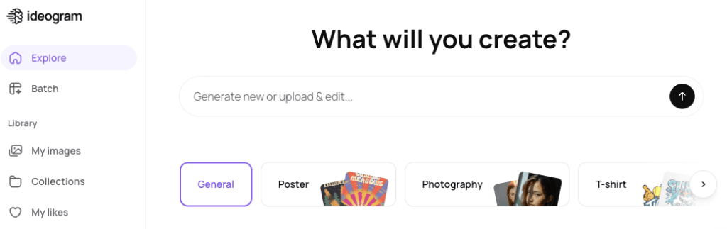
Ideogram started life as a tool built specifically around one problem: putting accurate, stylized text inside images. The team — many of whom came from Google Brain — engineered the model from the ground up to handle typography. Posters, logos, social media graphics, quote cards, branded content. That’s its DNA. Ideogram 3.0 also added Canvas, a built-in editor with inpainting (Magic Fill) and outpainting (Extend), which made it a more complete workflow tool rather than just a text-in-image generator.
Both are good. Neither is universally better. The difference is in which kind of job you’re throwing at them.
Key Differences at a Glance
| GPT Image 2 | Ideogram 3.0 | |
| Text rendering accuracy | ~99% (with thinking mode) | ~90–95% |
| Style control | Instruction-based | Style codes + reference images |
| Editing (inpainting) | Supported via API | Canvas / Magic Fill (built-in UI) |
| Outpainting | Limited consumer UI | Extend tool (built-in) |
| Free tier | Yes (Instant mode) | Yes (10 prompts/day, public) |
| Thinking/reasoning mode | Plus/Pro required | N/A |
| Best for | Complex layouts, photorealism + text | Typography-first, brand graphics |
Text Rendering and Layout Discipline
Okay, here’s where it gets interesting — and honestly, where I had to revise my priors.
Ideogram has been the undisputed leader in text-in-image generation for the past year or two. I had mentally filed it as “the text tool.” That was a fair label until about a week ago.
GPT Image 2 hits approximately 99% character accuracy in testing. Multi-line text, mixed scripts, small type in dense infographics — it handles all of it. I tested a restaurant menu prompt (the classic AI benchmark for text rendering) and got something that could actually go into production without a round of manual corrections. TechCrunch’s review noted the same thing: text that would have been garbled nonsense in DALL-E 3 now comes out clean.
Ideogram at 90–95% is still excellent — and it’s been doing this reliably for much longer. The difference in practice is that Ideogram very rarely gets stylized text wrong. Its typography instincts are baked in deeply. It understands poster hierarchy, headline vs. subhead sizing, font mood. GPT Image 2 is more accurate as raw rendering, but it doesn’t have the same design sensibility around type. If you need words that are readable and placed correctly, both will get you there. If you need words that look intentionally designed, Ideogram still wins.
One specific scenario where Ideogram still edges ahead: highly stylized fonts (handwritten, graffiti, 3D lettering). The model has a distinct aesthetic vocabulary around typography that GPT Image 2 doesn’t replicate yet.
Editing and Iteration Workflow
This is where the two tools feel most different day-to-day.
Ideogram’s Canvas is a proper editing environment. Magic Fill lets you paint a region and describe what you want to change. Extend lets you push the canvas out. Background removal is one click. It’s all inside the same interface, no API juggling needed. For non-technical creators, this is a big deal — you stay in one place, you iterate visually, you don’t lose your session context.
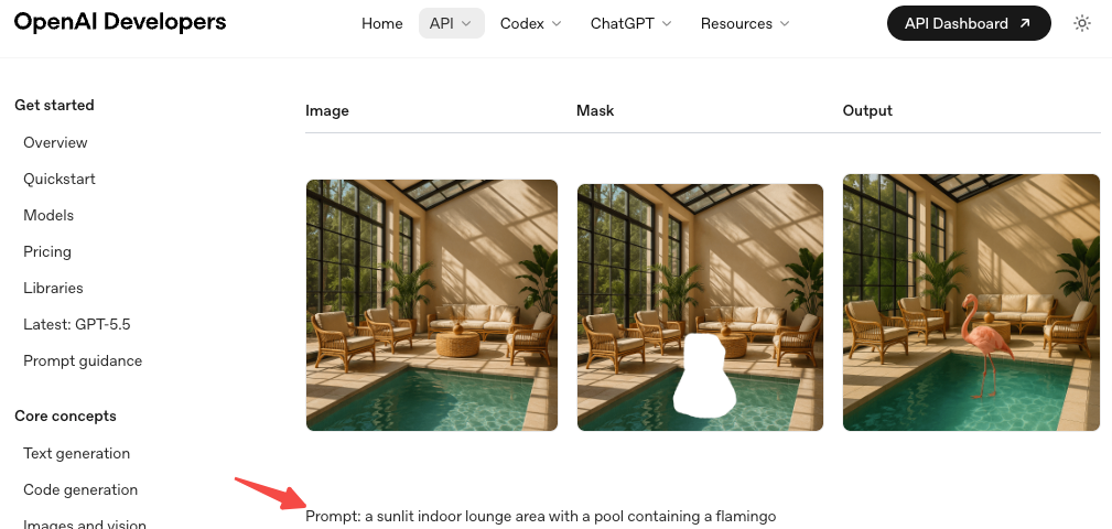
GPT Image 2 also supports inpainting via the image edits endpoint, and the chat-based iteration is genuinely impressive when you’re in ChatGPT. You can say “move the logo to the upper left” and it will actually try to do that rather than regenerating from scratch. But — and this is a real but — the editing controls through the consumer interface aren’t as tactile as Ideogram’s Canvas. You’re describing changes in text; you’re not painting masks.
For someone who thinks spatially and wants to grab a brush and fix one thing, Ideogram is more satisfying. For someone who prefers describing what they want and letting the model figure out the spatial interpretation, GPT Image 2 in ChatGPT can feel faster.
Brand Graphics and Creator Workflow Fit
If you’re producing a lot of social content with consistent styling — same color palette, same vibe, recurring visual language — Ideogram has a genuine advantage.
Style Codes are the underrated feature here. You run a generation you like, save the style, and every future generation pulls from that aesthetic fingerprint. Combined with the three-image style reference upload, it gives you a form of brand consistency that’s hard to replicate through prompt-writing alone. For creators who have a visual identity they’re maintaining, this is practical muscle.
GPT Image 2‘s approach is more prompt-driven. You describe the style, you reference it in language. It follows detailed instructions well — the model’s reasoning mode does spend time planning before generating, which shows in the coherence of complex compositions. But replicating a style reliably across sessions requires more careful prompting work.
Ideogram also wins on cost structure for pure social content creation. If you’re making Instagram graphics, quote cards, or thumbnail variations at volume, that math is friendlier than working through ChatGPT Plus at $20/month.
Which Tool Fits Which Type of Creator
Go with GPT Image 2 if:
- You’re making UI mockups, product screens, or anything that requires tight text + layout precision
- You need photorealistic scenes with text baked in (menus, posters with photography)
- You’re already in the ChatGPT/OpenAI ecosystem and want a seamless workflow
- You’re generating infographics or data visualizations where accuracy > style
- You need multilingual text (Japanese, Korean, Hindi, Bengali — GPT Image 2 handles these more reliably)
Go with Ideogram if:
- Typography style is part of the deliverable — logos, posters, typographic social graphics
- You’re maintaining a consistent visual brand and need Style Codes
- You want a standalone, visual editing environment without switching apps
- Budget matters and you’re generating high volume (Ideogram’s pricing is more accessible)
- Your workflow is design-first, not chat-first
Use both if:
- You do varied work: GPT Image 2 for complex realistic scenes, Ideogram for type-heavy brand graphics
- This is genuinely what I do now, and it’s not as annoying as it sounds
Decision Guide: When to Choose Each One
Scenario: You’re making a promotional poster with a headline and event details → Ideogram. The typographic instincts are better, and Magic Fill makes small corrections easy.
Scenario: You need a UI mockup with realistic interface text for a stakeholder presentation → GPT Image 2. Reasoning mode handles spatial layout and text placement in UI contexts better.
Scenario: You’re producing 50 Instagram graphics this month with consistent branding → Ideogram. Style Codes + the Basic plan pricing make this practical at volume.
Scenario: You want a photorealistic product shot with label copy → GPT Image 2. Photorealism + text together is where its generalist strengths show.
Scenario: You need multilingual text in the same image → GPT Image 2. Its multilingual rendering across non-Latin scripts is more consistent.
Scenario: You want to extend an image beyond its original canvas → Ideogram Canvas. The Extend tool is more accessible than GPT Image 2’s outpainting.
FAQ
Is GPT Image 2 better than Ideogram at text rendering?
In raw accuracy, yes — GPT Image 2 scores higher on character-level correctness, especially for dense and multilingual text. But Ideogram still has a design sensibility advantage for stylized typography. If your goal is “readable,” GPT Image 2 leads. If your goal is “beautiful typography,” Ideogram remains the go-to.
Does GPT Image 2 require ChatGPT Plus?
Instant mode is available to all ChatGPT users. Thinking mode — which delivers the best text rendering and complex layout results — requires a Plus or Pro subscription. API access via gpt-image-2 is available to developers with pricing based on input/output tokens.
What happened to DALL-E 3?
DALL-E 3 and DALL-E 2 are being deprecated on May 12, 2026. GPT Image 2 (gpt-image-2) is their replacement as the default image model across ChatGPT and the OpenAI API.
I’m making YouTube thumbnails. Which should I use?
Start with Ideogram — it’s better at combining bold typography with visual backgrounds in a design-first way. If you need photorealistic photography-style thumbnails, try GPT Image 2 for the base image and then add text in Ideogram or a design tool.
Conclusion
A week ago I would have told you Ideogram was the unambiguous choice if text-in-image was your priority. That’s less true now.
GPT Image 2 is genuinely a different product than its predecessors — not an incremental update. The text rendering is reliable in a way that changes what you can realistically build with it. For complex layouts, UI mockups, multilingual content, and photorealism + text combinations, it’s now the stronger tool.
Ideogram’s edge is in typographic craft, style consistency, and a cleaner standalone editing experience that doesn’t require you to live inside a chat interface. For creators with a visual brand to maintain, that still matters a lot.
My workflow after a week of testing: GPT Image 2 for anything technical or photorealistic where accurate text is needed, Ideogram for poster and social content where I want the typography to look intentional. Not the most elegant answer, but it’s the honest one.
Previous Posts: