I’m Dora and I’ll be honest — I almost didn’t test this one seriously.
Every time an AI image model promises “finally readable text,” I run the same gauntlet: a restaurant menu, an event poster, a LinkedIn carousel slide with three bullet points and a subheading. And every time, something goes wrong. A letter warps. A number inverts. The whole thing ends up looking like a font had a rough night.
So when OpenAI dropped ChatGPT Images 2.0 on April 21, 2026 — with “near-perfect text rendering” as the headline — I made myself actually test it before writing anything.
What I found surprised me enough to write this.
Not because it’s flawless (it isn’t). But because, for the first time, I made a poster with real readable text and felt like I could hand it to a client. That’s the bar I’m working with, and GPT Image 2 clears it for most text-heavy graphic use cases — if you know how to prompt it and where to spot the cracks.
Here’s the workflow that actually works.
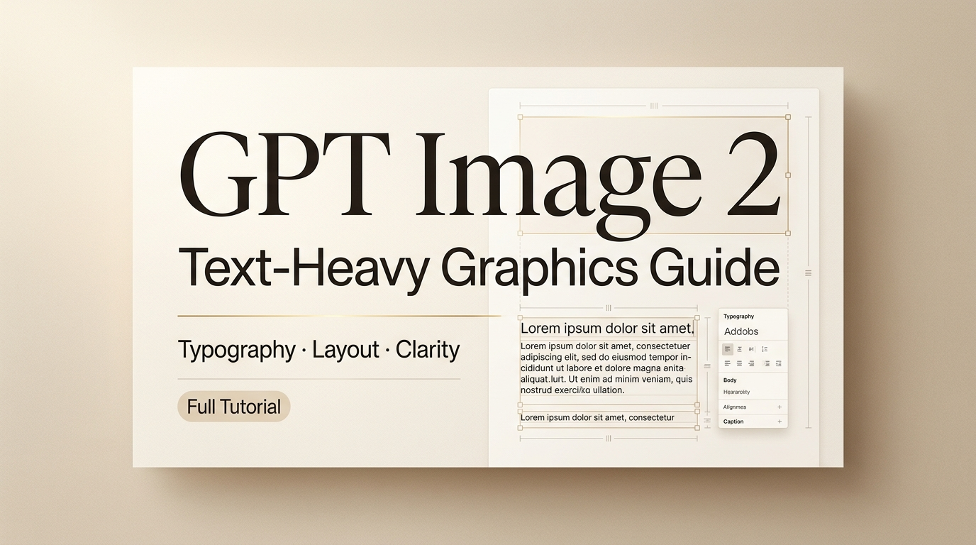
What GPT Image 2 is and why text-heavy graphics matter
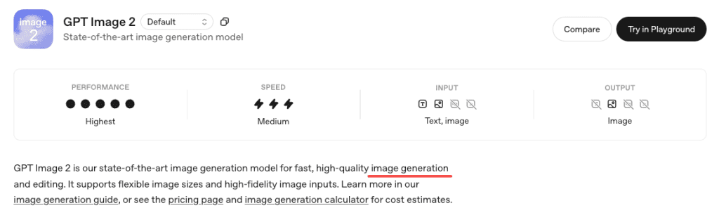
GPT Image 2 is OpenAI’s latest image model, released April 21, 2026 as gpt-image-2, replacing DALL·E 3 and GPT Image 1.5. It runs directly inside ChatGPT for paid users—no setup needed.
What really sets it apart isn’t just better visuals, but accurate text rendering. Earlier models struggled with spelling—headers, price tags, and menus often came out garbled, making them unreliable for real-world design work.
According to TechCrunch’s review, GPT Image 2 can now handle small text, UI elements, icons, and dense layouts much more reliably (up to 2K resolution). It’s not perfect, but it’s good enough to make AI-generated graphics actually usable.
What you need before you start
Access path and prompt ingredients
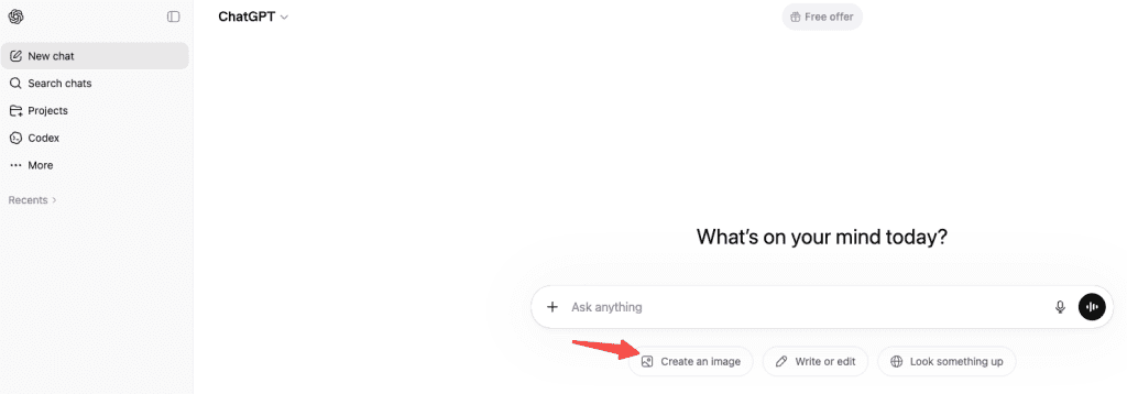
GPT Image 2 works on all ChatGPT plans, but Thinking mode (available in Plus, Pro, Business, Enterprise) gives better results for text-heavy graphics because it plans the layout first.
How to use: Open ChatGPT → choose a Thinking/Pro model → enter your image prompt.
For prompt ingredients, every text-heavy graphic prompt needs four things:
- The exact text you want, quoted, spelled the way you want it to appear
- A layout description (where text goes relative to visuals)
- A style cue (flat design, photorealistic mockup, editorial poster, etc.)
- A negative prompt to suppress extra text the model tends to add on its own
That last one matters. GPT Image 2 has learned that text is good, so it wants to add labels and captions to everything. Tell it not to: “no additional text, no random labels, no typographic elements beyond what’s specified.”
When to use classic vs thinking
Use Thinking mode when:
- The graphic has multiple text elements that need to coexist without overlapping
- You need text at small sizes (subheadings, footnotes, captions)
- The layout involves hierarchy (headline > subhead > body copy > CTA)
- You’re working with mixed scripts or non-Latin characters
Use classic (instant) mode when:
- You just need a quick concept pass to see if the visual direction works
- The text is one element, large, and doesn’t need to interact with much else
- You’re iterating quickly and plan to refine in a follow-up prompt
The generation time difference is real — Thinking mode is noticeably slower. But for anything that’s going near a client or a real channel, the extra wait is worth it.
Step-by-step workflow for posters, carousels, and thumbnails
Build the layout prompt
The single biggest mistake I see in prompts for text-heavy graphics is treating text as an afterthought. Something like: “Create a summer festival poster with colorful visuals and text saying ‘Riverside Festival June 14’.”
That works maybe 40% of the time. Here’s what works closer to 90%:
Describe the image like you’re briefing a designer. Start with the overall composition, then move to the style, then to the typography, then to the secondary details. The OpenAI image generation prompting guide specifically recommends building prompts with concrete specifics — exact text strings, font weight descriptors, placement language (“upper third,” “bottom-left corner,” “centered below the main image”).
An example that worked well for me:
A flat-design event poster, white background with warm cream texture. At the top in bold dark serif: “RIVERSIDE FESTIVAL”. Immediately below, in smaller medium-weight sans-serif, the text “June 14 · Waterfront Park · Free Entry”. In the center, an illustrated crowd silhouette against a sunset. Bottom-right corner, small and muted: “Doors open at 4PM”. No additional text, no random labels, no decorative typographic elements.
What you’ll get: pretty much that, spelled correctly, with the hierarchy intact. The model respects “at the top,” “immediately below,” and “bottom-right corner” as actual positioning instructions now — that was not reliably true with GPT Image 1.5.
Check spelling, numbers, and hierarchy
Here’s the honest part: don’t fully trust it.
GPT Image 2 is much better at text than older models — but it’s still not a proofreader. It generates, it doesn’t typeset.
In my testing, Latin script at headline sizes was nearly always correct. Where things got shaky:
- Numbers with multiple digits, especially in tight spacing (dates, prices, phone numbers)
- Very small text — caption-size copy below about 10–12pt equivalents started blurring
- Fully packed layouts — when I pushed for five separate text elements in a carousel slide, I’d get two or three perfect and then one with a slightly wrong character
The model also has a known issue with tight cropping on vertical formats — poster footers can get clipped. I lost a CTA button on two of my early poster tests before I started adding “include generous bottom padding, full frame visible” to my prompts.
My QA checklist before using any output:
- Every word spelled correctly?
- Every number exactly right?
- No extra text the model added spontaneously?
- Bottom edge visible and not cropped?
- Text hierarchy reads in the right order (headline > subhead > body)?
- Nothing overlapping the text?
If anything fails, use the chat interface to fix it: “The date reads ’14 June’ but should read ‘June 14’ — please fix only that element.” Multi-turn editing with context preservation is one of GPT Image 2’s genuine strengths, and it works well for targeted corrections.
Export and human QA
For final outputs, download at the highest resolution available. The model generates at up to 2K natively, and you can request specific dimensions in your prompt.
From there: apply your normal human QA pass. Read every word. Check every number. For anything going to print or a paid ad, run the text through a second set of eyes regardless of how clean the AI output looks.
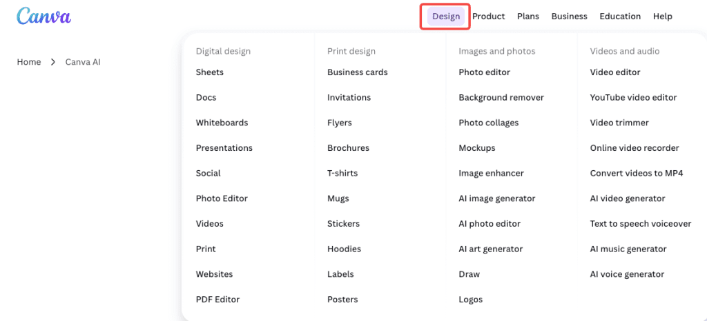
One thing I’ve started doing: for thumbnails and social graphics, I generate the AI image for the visual composition, then add the final text in Figma or Canva. Yes, GPT Image 2 can do it in one pass. But if the text is the legally important part (price, date, event name), doing it in a tool where you have full control over the letterforms removes the last 5% of risk entirely.
Limits, risks, and trade-offs
Let me put this plainly because I’ve seen too many writeups skip it.
GPT Image 2 is not a replacement for a professional design tool. According to VentureBeat’s testing, the model is described as a “polyglot” with strong non-Latin support, and I verified that for Japanese and Korean in my own tests — both rendered cleanly at headline sizes. But multilingual text at small sizes, or mixed-script lines (Japanese + English inline), was less consistent.
Other real limits I ran into:
- Brand logos: It’ll approximate, not match → always add logos in post
- Charts & graphs: Looks right, data may be wrong → never trust without verification
- Long text blocks: Short text is fine, paragraphs break (spacing, characters drift)
- Mixed scripts / small text: Japanese + English or tiny captions can get inconsistent
- Certain content types: May refuse or alter phrasing due to safety policies
The knowledge cutoff is December 2025, which means anything referencing events or products from 2026 might need a web search assist from Thinking mode to render accurately.
Alternatives for harder design tasks
If GPT Image 2’s limits matter for your use case, here’s where I’d redirect:
For precision typography and final layouts — Figma, Canva, or Adobe Express. Not AI-generated, but you get pixel-perfect control. Use GPT Image 2 for the visual composition and handle text separately.
For high-volume social graphic generation — tools like Canva’s AI features or template-based generators that let you lock down the text fields while varying the visuals. Less creative flexibility, more reliability at scale.
For multilingual carousels at scale — GPT Image 2 is actually one of the better options right now, especially for Japanese and Korean. But still do a QA pass on every output before publishing.
For motion and video thumbnails — generate the static frame in GPT Image 2, then bring it into a video tool if you need animation. The still image quality is solid enough to use as a base.
FAQ
How do I stop it from adding random text I didn’t ask for? End your prompt with something like: “No additional text, no random labels, no typographic elements beyond what’s specified.” The model has learned that text = good, so it needs explicit instruction to leave blank space alone.
Is it good enough for client work? For concept mockups and quick visual directions, yes. For final deliverables, do a full proofread and fix any errors using the chat-based edit tool or by adding final text in Figma/Canva. It’s significantly faster than starting from scratch, but the human QA step doesn’t go away.
Does it handle non-Latin scripts? Yes, and this is one of the genuine breakthroughs. Japanese, Korean, Chinese, Hindi, and Bengali all rendered correctly in my headline-size tests. Small-print non-Latin text was less consistent. Always verify character accuracy if it’s mission-critical.
How long does Thinking mode take? Roughly two to four minutes for a complex graphic, in my experience. Simple layouts are faster. It’s slow enough that I wouldn’t use it for rapid iteration — use classic mode for exploration and switch to Thinking for finals.
Wrapping up
Honestly? I’ll keep coming back to this for the workflow it saves. Not because the text is always perfect — it isn’t — but because the first draft is now actually useful, and fixing two small things in a chat conversation beats rebuilding from a blank canvas in a design tool every time.
The gap that GPT Image 2 closes is the one that mattered most: you can now tell it what to write, and it writes it. Readable, mostly correct, properly placed. That’s new.
Just build the QA step into your process and don’t skip the proofreading pass. The model is fast. That doesn’t mean the output is infallible.
Previous Posts: