I was putting together a set of promo graphics for a small client recently — nothing fancy, just social cards and a few ad mockups — when I decided to swap my usual workflow for GPT Image. I’d been hearing enough noise about it that I figured it was time to stop skimming hot takes and actually sit down with it for a few hours.
Spoiler: I came away genuinely impressed on some things, mildly frustrated on others, and convinced that most of the conversation around this model is missing the point. So here’s Dora’s real-talk breakdown from a creator’s chair, not an AI researcher’s lab.
What GPT Image 2 is built for
Before I get into results, I want to reframe something. Most reviews I’ve read spend too much time on architecture and benchmarks. That’s not how I think about image generation tools. The questions that actually matter to me are: can it handle text clearly, does it behave when I give it a complex layout, can I get consistent results across a batch, and how much back-and-forth does editing take?
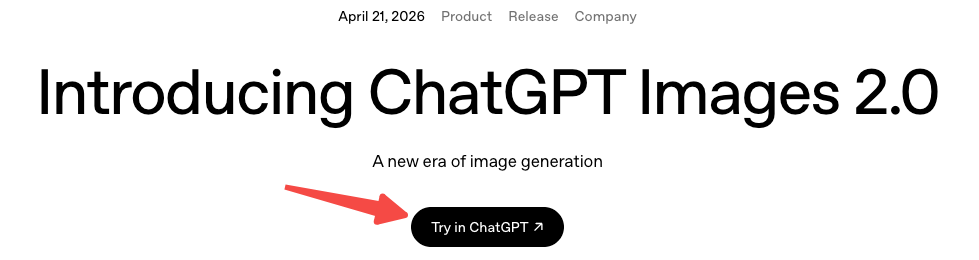
GPT Image 2 — officially launched April 21, 2026 as part of ChatGPT Images 2.0 — is OpenAI’s latest native image generation model, built directly into ChatGPT and accessible via API. It’s not a standalone app. It lives inside a chat workflow, which matters a lot for how you interact with it.
How we evaluate it for creator work
I’m not running blind tests with randomized seeds and 500-image sample sizes. I’m running it through the kind of tasks I actually do or help friends do: social graphics, ad mockups, multilingual visuals, and things that need to stay consistent across multiple outputs.
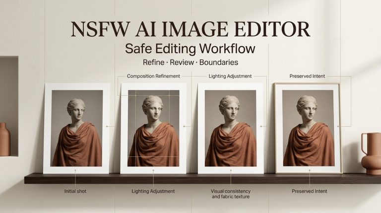
Posters and social graphics
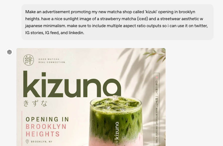
This is where GPT Image 2 caught my attention. Text rendering — historically the Achilles’ heel of AI image generators — is noticeably better here. Short labels, single-line headlines, and simple callouts land cleanly most of the time. I threw it a poster brief with a five-word headline and a subhead, and the first attempt was readable without hallucinated letters. That felt like a small miracle compared to where things stood 18 months ago.
The layout compliance is also solid for straightforward compositions — a clear hierarchy, a product shot on the left, text on the right. Where it starts to wobble is when you push beyond two focal zones. I tried a magazine-style grid with three columns and got back something that understood the concept but hadn’t quite read the brief. Serviceable, not great.
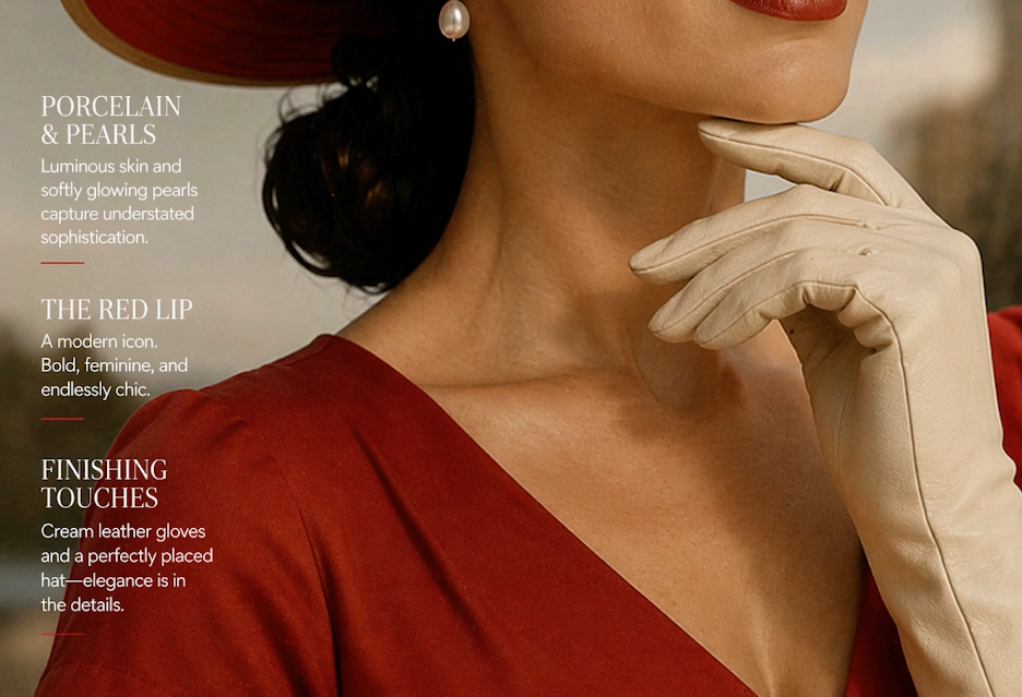
One thing worth flagging: the artistic personality of GPT Image 2 trends toward polished and editorial. It’s clean. Sometimes too clean. If your brand has edge or grit, you’ll need to push it pretty hard to get there. For mainstream social content, though, that polish works in your favor.
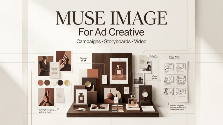
Ad mockups and UGC-style visuals
Here’s where things get a bit more mixed. For clean ad mockups — mocking up a product on a white background, adding a lifestyle context, creating a simple overlay — it performs well. Turnaround is fast, the outputs look usable, and the instruction-following is good enough that you don’t feel like you’re fighting the model.
UGC-style content is trickier. The model tends to produce results that look a bit… composed. There’s an inherent tension between training on high-quality images and simulating the casual, slightly imperfect aesthetic of user-generated content. You can get there with careful prompting, but it’s not the default.
I also tested it on a batch where I needed visual consistency across four frames — same character, different poses. Honestly? It struggled. The face drifted by frame two and was clearly a different person by frame four. This isn’t a GPT Image 2-specific failure — researchers studying cross-image consistency in diffusion models have documented it as a fundamental challenge across the field — but it affects real creator workflows significantly.
Multilingual and text-heavy tasks
This is the area I was most pleasantly surprised by. I threw it Korean, Japanese, and Arabic text tasks — things that historically result in garbled or partially rendered characters. Performance was meaningfully better than what I’ve seen from comparable models. Not perfect — I caught a few character errors in Arabic — but the failure rate was low enough that it’s actually usable for multilingual creative work, provided you check outputs carefully.
For text-heavy designs — infographic cards, pricing tables, quote graphics — it holds up reasonably well for simpler structures. When you layer in more text blocks, the spatial reasoning starts to show cracks. It knows roughly where things should go, but the precision you’d expect from a designer isn’t there.
What it does well
Let me be direct about the genuine wins.
Text rendering is a meaningful step forward. The GPT Image 2 API documentation confirms the model was built specifically for legible text in image outputs — and that training shows. Short headlines, labels, and simple callouts land cleanly far more often than earlier versions. If you’ve been burned by garbled signs and misspelled product labels before, this one is worth retesting.
Instruction following is strong. If you give it a detailed, well-structured prompt, it takes direction well. Working inside a chat interface pays off here — you can iterate conversationally, refine in plain language, and the model tracks changes across turns better than a standalone generator would.
Speed and accessibility are real advantages. For creators who want something they can use without switching tabs or apps, the native ChatGPT integration is genuinely convenient. The feedback loop is short.
Photorealistic outputs for product and lifestyle shots. If you’re doing e-commerce mockups or lifestyle advertising, the model performs at a level that can meaningfully reduce reliance on stock photography in early-stage ideation.
Where it still falls short
I’d be doing you a disservice if I didn’t say this clearly: don’t trust the details without checking them. Specific brand elements, small print, complex layouts, accuracy-sensitive content — always verify before commercial use. AI image models don’t fact-check, and GPT Image 2 is no different. As VentureBeat’s hands-on coverage notes, the model’s knowledge cutoff is December 2025, meaning anything newer may come out wrong or be supplemented by web search in Thinking mode — and that supplemented information still needs your eyes on it.
Artistic range is narrower than some alternatives. If you’ve spent time with models tuned for illustration, painterly aesthetics, or experimental styles, you’ll notice GPT Image 2’s comfort zone skews toward the clean and editorial. Getting genuinely raw, weird, or highly stylized outputs takes more prompting effort.
Cross-image consistency remains unsolved. Character drift across multiple images is a real limitation — and as I mentioned, not just for this model. If you need the same person to look like the same person across a four-image set, you’re still going to need additional tooling or workflows.
Prompt sensitivity can feel finicky. Small changes to phrasing sometimes produce disproportionately different outputs. That’s not always bad — experimentation is part of the process — but if you’re trying to reliably reproduce a visual direction, it adds friction.
GPT Image 2 vs other tools
I’m not doing a full head-to-head here — that deserves its own post — but a few honest observations.
For pure image quality on simple product shots, GPT Image 2 is competitive with the current field. For artistic flexibility and stylistic range, there are models with a stronger aesthetic personality. For cross-image consistency in character or object tracking, purpose-built workflows still outperform general-purpose generators.
The real differentiator is the chat-native workflow. If you’re already living in ChatGPT, the integration is seamless. If you’re not, the switching cost is low but worth factoring in.
The Microsoft Azure Foundry documentation on GPT Image 2 covers the enterprise angle well if you’re evaluating it for production pipelines at scale — including resolution controls and intelligent routing that don’t come up much in consumer-focused reviews.
Who should use it in 2026
Yes, try GPT Image 2 if:
- You’re doing social content, light ad creative, or lifestyle mockups
- Multilingual text in visuals is part of your workflow
- You want fast iteration inside a chat interface
- You’re early in ideation and need usable drafts, not final assets
Be cautious if:
- Cross-image character consistency is critical
- You need highly stylized or artistically distinctive outputs as a default
- You’re working with accuracy-sensitive content (always verify)
- You need complex multi-element layouts to land precisely on the first pass
FAQ
Is GPT Image 2 good enough for commercial use? For early-stage mockups and ideation, yes. For final commercial assets, treat outputs as a starting point and plan for human review and refinement — especially for text accuracy and brand-specific elements.
How does it handle complex prompts? Better than most. Long, structured prompts tend to produce more compliant outputs. But there’s still a ceiling — spatial reasoning across complex layouts is an area where the model doesn’t fully close the gap with professional design work.
Can it replace stock photography? For lifestyle and generic product contexts in early ideation, it reduces reliance on stock. For anything where you need precise, branded, or accuracy-critical imagery, not yet.
Does it work for non-English text? Better than previous generations. Results for Korean, Japanese, and Arabic showed meaningful improvement in my testing, though you should check outputs carefully. Don’t assume correctness without verification.
What’s the biggest limitation creators hit? Cross-image consistency — keeping the same character or object visually stable across multiple outputs. It’s the most common real-world complaint, and it’s real.
Conclusion
GPT Image 2 is a genuinely useful tool for the right tasks. Text rendering, instruction-following, and speed are real strengths. The chat-native workflow is convenient if you’re already in that ecosystem. Where it struggles — cross-image consistency, artistic range, complex layouts — those are limitations you need to plan around, not hope away.
I’ll keep using it for social graphics and early-stage ideation. But I’m not retiring my other tools. For most creator workflows, the answer isn’t one generator — it’s knowing which one to reach for when.
Previous Posts: