I was putting together a product visual last week — a simple mockup with a headline and a tagline — and something I’d been putting off for months finally clicked. The text actually landed. Clean, spaced, readable. Not the usual garbled approximation that made me reach for Photoshop five minutes later.
That’s when I realized GPT Image 2 prompts work differently from what I’d been doing. Not radically differently. But enough that my old habits were leaving real quality on the table.
This isn’t a recap of features. If you want to know what GPT Image 2 is, OpenAI’s official introduction to ChatGPT Images 2.0 covers that.
As Dora, I’m focusing on one thing here: how to write prompts that get you usable outputs faster — for ads, storyboards, product visuals, and the kind of creator work where re-generating the same image six times isn’t a workflow.
What Makes GPT Image 2 Prompts Different
Earlier image models often rewarded dense keyword stacking (“cinematic lighting, 8K, masterpiece, photorealistic”). GPT Image 2 performs better with clear, intent-driven descriptions—like briefing a photographer or art director. You define the subject, audience, composition, and purpose; the model handles execution details more intelligently.
Text rendering stands out as a major leap. The model delivers accurate, multi-line copy with strong legibility, including mixed scripts and multilingual support. This makes single-prompt social graphics, packaging mockups, and posters far more viable.
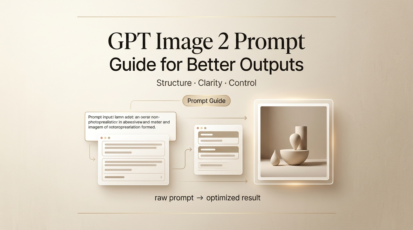
Key practical insight: The first ~50 words carry disproportionate weight. Front-load your core subject, composition, and style to anchor the output effectively. Burying essentials later often leads to diluted results.
A Prompt Structure That Works
Subject, Layout, Text, Style, and Constraints
This five-part framework (not every prompt needs all elements) has proven consistent across my tests for social posts, storyboards, and product shots:
- Subject: Describe the scene, people/objects, positioning, and action as a director would.
- Layout: Specify composition (e.g., centered product shot, square social post, two-column infographic, multi-panel storyboard).
- Text: For readable copy, quote exact strings, label roles (headline, subhead, label), note placement, font style if relevant, and add “verbatim — no substitutions.”
- Style: Reference real visual cues (e.g., “Kodak Portra film stock, soft natural daylight, shallow depth of field, editorial photography”).
- Constraints: Explicitly exclude unwanted elements (“no watermark, no extra props, no border, no cartoonish stylization, no shadow artifacts”).
A full prompt using this structure looks like this:
Product shot of a matte black water bottle on a white studio surface. Centered, slight three-quarter angle. Label reads “HYDRA” in bold sans-serif at the top of the bottle, white text, 100% legible. Clean editorial product photography, softbox from camera-left, neutral grey gradient backdrop. No watermark, no extra props, no shadow artifacts.
That’s not a long prompt. It’s a precise one.
When to Use Classic vs. Thinking
ChatGPT Images 2.0 offers two modes:
- Instant (default, fast): Ideal for straightforward prompts, rapid variations, backgrounds, or textures. Best when speed matters for batch work.
- Thinking: Leverages reasoning to plan layouts, verify consistency, and (when needed) reference current information. Superior for structured text, complex compositions, infographics, or multi-image sets (e.g., carousels or comic panels). It adds time but reduces unusable outputs on first tries.
Decision guide:
- Use Instant for simple creative tests or high-volume iterations.
- Use Thinking for text-heavy layouts, brand consistency across panels, or precise spatial relationships.
Prompt Formulas for Common Creator Tasks
Ads and Social Graphics
Social graphics are where the text accuracy upgrade pays off most. Here’s the formula I use:
[Format: e.g., square social post / landscape banner] + [Subject and scene] + [Exact copy in quotes with role labels] + [Brand aesthetic or style direction] + [Constraints]
Example:
Square social post. Lifestyle shot of a person holding a coffee cup, warm morning light, cozy kitchen background. Headline at top: “Start slow.” Subhead beneath: “Premium blends, shipped monthly.” Both in clean sans-serif, white text, no more than two lines each. Warm editorial style, muted earth tones. No watermark, no logo, no extra text.
For localized ads — a format where GPT Image 2 has a real edge — add the exact copy in the target language and note the script explicitly. “Japanese: 今週のおすすめ” works better than “translate this to Japanese.”
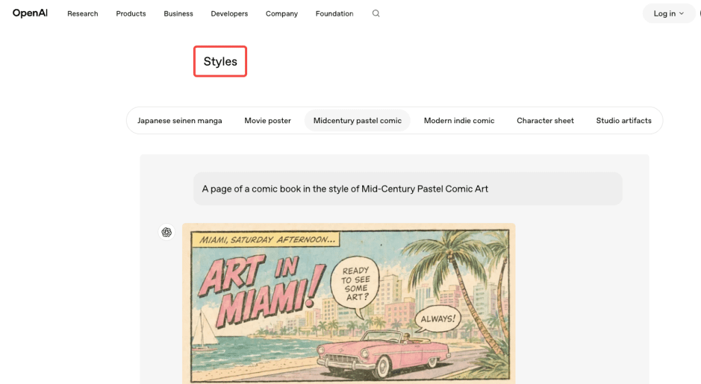
Storyboards and Comics
Multi-panel work is where Thinking mode earns its time cost. The formula:
[Number]-panel [style, e.g., manga / editorial comic / storyboard]. Consistent character: [physical description]. Panel 1: [action + expression + any dialogue in quotes]. Panel 2: [same]. Maintain character design across all panels. [Art style]. Speech bubbles with exact text.
What I’ve found: character consistency across panels is better when you describe the defining physical traits once at the top (“short dark hair, round glasses, olive jacket”) and reference them as “the character” in each panel rather than re-describing.
Product Visuals and Mockups
For product shots, the structure is almost entirely about preservation and constraint:
[Product type and surface]. [Camera angle and distance]. [Exact label text if needed, in quotes, with placement]. [Lighting setup]. [Background description]. No watermark, no extra products, no compositional additions.
The “no compositional additions” line matters. Without it, the model occasionally adds props, shadows, or secondary items it inferred from context. If you want a clean, isolated product shot, you have to say so.
For packaging mockups with real label copy, the OpenAI image generation documentation recommends using quality: high for any dense text or fine typographic layouts. Medium works for most product photography, but text-heavy labels benefit from the upgrade.
Why Prompts Fail and How to Fix Them
I keep a running log of failed prompts because the failures are more instructive than the wins. The patterns I see most often:
Vague text instructions. Writing “include a headline” instead of specifying the exact copy. The model will invent plausible text — which means it’ll invent something wrong.
Burying the subject. If your first sentence describes the background, the background becomes the priority.
Skipping constraints. Every photorealistic prompt should end with a constraint line. The model infers what looks plausible — which sometimes means watermarks, borders, or stylized elements you didn’t ask for.
Conflating Thinking mode with quality. Thinking mode improves layout reasoning and multi-image consistency, not the visual quality of a simple portrait. Using it for everything adds latency without return.
Over-specifying everything at once. Listing twenty requirements often causes the model to drop several. Start with the five to eight most important, confirm they work, then iterate.
One thing I genuinely didn’t expect: explicit negative constraints sometimes do more work than positive descriptions. “No watermark, no border, no studio logo” is often the difference between an output I can use and one I have to edit.
FAQ
Does GPT Image 2 work with reference images? Yes. Label each input by role in your prompt (“Image 1 is the product. Image 2 is the style reference.”) and the model uses that framing. Useful for brand-consistent work where you have an existing visual identity to match.
How specific does the text instruction need to be? Very specific. Quote the exact string, name the text block role (headline, caption, label), specify placement, name the font style, and add “verbatim — no substitutions.” Each layer reduces the chance of the model paraphrasing your copy.
When does Thinking mode actually help? Complex layouts with multiple text elements, infographics with spatial relationships, and multi-panel consistency — comic pages, social carousels. For single-image creative work without structured text, the extra time usually isn’t worth it.
What about brand logo reproduction? Still inconsistent. The model understands logos conceptually but doesn’t reliably reproduce exact vector shapes or proprietary typefaces. Generate the surrounding composition and composite your logo in afterward.
Is there a quality setting I should default to? Medium for most cases. Use high for text-heavy outputs — infographics, poster copy, packaging labels. Use low for drafts and batch testing.
Wrap-Up
Prompting GPT Image 2 better isn’t about learning a new system. It’s about being the kind of specific a director is when briefing a photographer — describing the scene, the shot, the copy, the constraints — rather than listing adjectives and hoping the model infers the right image.
The text rendering shift is what I keep coming back to. For creators who’ve been hand-compositing copy onto AI images because the models couldn’t be trusted with real headlines, that workaround is mostly gone now. You still need to be deliberate, but deliberate plus specific is a lot better than deliberate plus Photoshop.
If you’re testing this for ad creative or product shots, OpenAI’s production prompting guide for gpt-image-2 is the clearest breakdown of what the model handles well and what still trips it up.
Previous Posts: