Hey, it’s Dora. I was staring at a brief for a UGC-style product ad at around 11 PM — the kind with a lifestyle photo, a discount callout, and a CTA that needs to be legible in both Stories and feed. My usual flow would’ve been: write the prompt, paste it into three different tools, export, pull into Figma, resize, repeat. It takes forever.
So I figured: GPT Image 2 just dropped. Let me actually put it through the whole workflow — not just the “ooh, pretty picture” test, but the unglamorous part where you need four size variants, readable price text, and a version your client won’t make you redo from scratch.
Here’s what I found — the good, the annoying, and the stuff that actually saved me time.
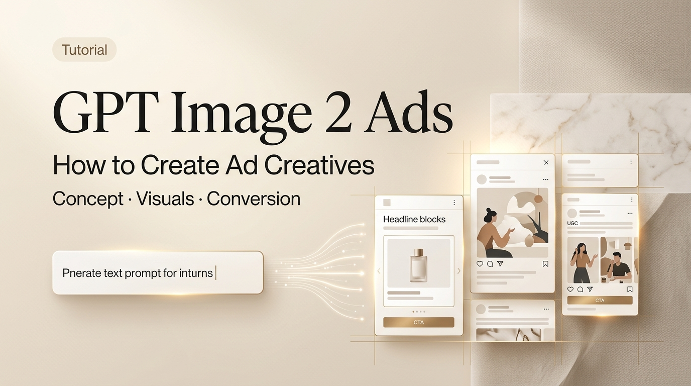
What GPT Image 2 Is and When to Use It for Ad Creatives
GPT Image 2 launched on April 21, 2026, as part of ChatGPT Images 2.0. It’s OpenAI’s current flagship image model — and unlike DALL-E 3, which used to mangle any text you asked it to render, this one was rebuilt specifically to fix that.
The headline improvement that matters for ad work: near-perfect in-image text rendering. Prices, CTAs, taglines, even multi-line copy — they come out legible. That’s a genuine shift. I’ve been burned by AI-generated images with garbled promo codes enough times that I’ve developed a reflex to not trust them. With GPT Image 2, I actually stopped squinting.
What it’s good for, specifically:
- Static ad concept images with readable text baked in
- UGC-style hero images and lifestyle thumbnails
- Promotional banners with price callouts
- Social media creatives that need multiple platform sizes
- Quick first drafts you can actually show a client without embarrassment
What it’s not a replacement for: final brand assets that need pixel-perfect logo placement, legally vetted product photography, or any image destined for print. It’s a drafting and concepting tool, and it works best when you treat it that way.
What You Need Before You Start
Account, Access, and Aspect Ratio Setup
GPT Image 2 is live in ChatGPT for Plus, Team, and Enterprise subscribers. For API access — which you’ll want if you’re generating variants at volume — it’s available through OpenAI’s API. Worth checking the OpenAI image generation docs before you start, because the size parameters changed with this release.
The model supports flexible aspect ratios now, which is a genuine upgrade. For ad work, you’re mainly working with:
- 1:1 — Instagram feed, Facebook feed square
- 9:16 — Stories, TikTok, Reels
- 16:9 — YouTube thumbnails, display banners
- 4:5 — Instagram feed vertical (often performs better than square in feed)
You can specify these directly in the prompt or via the size parameter in the API. Get this right before you generate anything — resizing after the fact doesn’t recompose the image, it just crops it.
Creative Brief and Brand Inputs
Don’t skip this step. GPT Image 2 follows complex instructions well, but “well” is relative to the clarity of what you give it.
Before you touch the prompt field, have these ready:
- Product description — what it looks like, what it does
- Tone and aesthetic — UGC-style, minimal, bold, etc.
- Copy elements — the actual text you want in the image (headline, price, CTA)
- Color direction — especially if you have brand colors
- Platform target — because that should determine your aspect ratio from the start
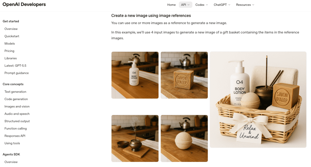
If you have a reference image — a previous ad that performed well, a mood board screenshot — you can upload it. GPT Image 2’s instruction-following for image editing is noticeably better than its predecessor.
Step-by-Step Workflow for Ad Creative Generation
Generate the First Concept
Prompt structure matters more than prompt length. The GPT image generation prompting guide recommends going: background/scene → subject → key details → constraints — and adding the intended use so the model calibrates its “mode” of output.
Here’s what that looks like in practice for a UGC-style skincare ad:
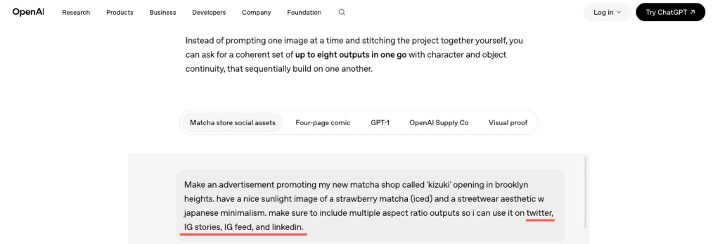
“Lifestyle product photo, warm natural light bathroom counter, a woman in her 30s applying serum, mid-shot. Product bottle front and center in foreground, label legible. Text overlay at bottom: ‘First Month FREE — Use Code GLOW25’. Clean sans-serif font, white text on soft dark gradient bar. Intended use: Instagram Stories ad, 9:16 ratio, UGC-style, warm and relatable, not polished or stock-photo-looking.”
A few things that tripped me up early:
- If you want specific colors, say them. “Brand green” means nothing to the model.
- The more specific your copy, the more accurate the rendering. “SALE” renders fine. “Save up to 37% on orders over $89” — that needed a second pass.
- “UGC-style” is a surprisingly effective style signal. The model actually tones down the polish.
Create Size and Copy Variants
This is where the workflow starts to pay off. Once you have a first concept you like, you can chat your way to variants.
“Recreate this at 1:1 for Instagram feed, keeping the same composition and copy.”
“Give me a version where the CTA says ‘Try It Free’ instead of ‘First Month FREE’.”
“Make a version with a darker background — the product is getting lost.”
Each turn preserves context from the previous generation, so you’re not starting cold. Honestly, this is the part I didn’t expect to work as well as it did. The composition held up across format changes better than I thought it would — it wasn’t just cropping, it was actually recomposing for the new aspect ratio most of the time.
That said: always compare variants side by side before committing. Sometimes an element shifts in ways that aren’t immediately obvious — the text might end up in a different position, or a prop disappears.
Review Outputs and Fix Misses
Go through the checklist you’d use for any ad creative before it leaves your hands:
Text accuracy first. Read every word in the image. GPT Image 2 is much better than previous models, but it’s not infallible — especially with longer strings, stylized fonts, or text that bleeds over a busy background. If the CTA is wrong, the ad is wrong.
Brand elements. If you fed the model a color palette, verify it landed. If you have a logo, you added it separately in post — GPT Image 2 will approximate, not replicate.
Faces and people. If there’s a person in the image, look at their hands. Still a weak point for most image models. Zoom in before you move on.
Platform compliance. Different ad platforms have different rules about text coverage ratios, prohibited categories, and disclosure requirements. The model doesn’t know your platform’s current ad policies — that’s your job to verify.
If something’s off, describe the fix conversationally. “The price text is cut off on the right — move it to be fully within the safe zone.” That usually works in one or two follow-ups.
Results, Limits, and Compliance Risks
My honest output after testing this for a full campaign brief: GPT Image 2 gets you to a presentable first draft faster than any other tool I’ve used. Not a final asset — a first draft. The gap between “AI draft” and “actually published” still exists, and it varies by campaign.
Where it genuinely helped:
- Concept exploration: generated eight directions in an afternoon that used to take two days of back-and-forth with a designer
- Copy variant testing: swapping CTAs and price callouts in minutes, not hours
- Client alignment: having something real to react to, not a mood board
Where I still needed human cleanup:
- Logo placement — always added in post
- Fine-tuned color matching to brand system
- Legal and compliance review of the final creative
On that last point: don’t skip it. OpenAI’s usage policies are clear that compliance with applicable laws is on you, not the platform. For ad work, this means you’re responsible for ensuring the creative doesn’t infringe third-party trademarks or copyrights — and as one legal analysis of AI-generated image copyright risks points out, the AI tool granting you access to generate something is not the same as that output being cleared for commercial use. Run a reverse image check on anything high-visibility before it goes live.
Platform ad policies are a separate layer — Meta, TikTok, and Google all have their own content review systems that may flag or reject AI-generated creative. This is not a reason to avoid the tool; it’s a reason to build a review step into your workflow.
GPT Image 2 vs Other Ad Creative Tools
| Tool | Best for | Text rendering | Format flexibility | Editing |
| GPT Image 2 | Concept drafts, copy variants, UGC-style | Excellent | High (custom ratios) | Chat-based, good |
| DALL-E 3 | Quick concepts, no text | Poor | Fixed presets only | Limited |
| Adobe Firefly | Commercial-safe brand assets | Good | High | Layer-based |
| Midjourney | Aesthetic/art direction | Poor | Preset ratios | Prompt-only |
| Canva AI | Template-based social content | Moderate | Fixed | Template-based |
The honest distinction: GPT Image 2 is the most capable tool for the drafting and concepting phase of ad production, especially when in-image text matters. Adobe Firefly is still the safer call for campaigns where IP indemnification is a hard requirement — its training data licensing is more explicitly commercial-safe. DataCamp’s hands-on testing of ChatGPT Images 2.0 has a solid breakdown of the aspect-ratio recomposition behavior if you want to dig into that specific comparison.
For most creator and small-team ad workflows, GPT Image 2 earns its place in the stack — just not as a replacement for every other step.
FAQ
Does GPT Image 2 work for Facebook and Meta ad formats?
Yes. You can generate at 1:1 for feed, 9:16 for Stories and Reels, and 1.91:1 for link ads by specifying dimensions in your prompt or the API size parameter. Always verify the output against Meta’s current ad specs before exporting — their text coverage rules and safe zone requirements change periodically.
Does it support transparent backgrounds for product shots?
Yes, GPT Image 2 supports transparent background generation. Specify “transparent background” in your prompt. Useful for product mockups where you want to layer the asset into a different scene later.
What’s the biggest mistake people make using this for ads?
Publishing the first output without reviewing the text. Seriously. Read every word in the image before you do anything else. It’s the thing most likely to be wrong, and it’s the most embarrassing thing to miss.
Is it worth using over my current AI image tool?
If in-image text accuracy matters for your use case — promotions, price callouts, CTA buttons — yes, the upgrade is meaningful. If you’re doing primarily artistic or aesthetic work with no copy in the image, the gap between GPT Image 2 and other current models is smaller.
Wrapping Up
GPT Image 2 genuinely moved the needle for ad creative drafting. The text rendering alone makes it more useful than any previous AI image tool I’ve tested for this specific workflow — and the multi-turn editing loop where you chat your way through revisions is faster than I expected it to be.
But it’s a drafting tool. The workflow that works is: generate fast → review carefully → clean up in post → run legal and compliance check → publish. Skip any of those steps and you’re asking for trouble.
I’ll keep using it for concepting and variant testing. On deadline days especially — when I need eight directions and a client-ready deck in an afternoon — it earns its place.
Previous Posts: